Guides

The Sixth Piece of the Puzzle

The concept for my project is a website called Uncovering History that will eventually serve as a repository for digital lessons I create to engage students in learning to think historically and to make that thinking visible.  The landing page for Uncovering History will briefly explain the concepts of historical thinking and coverage vs. uncoverage as expressed in the writings of Calder, Levesque and Wineberg for teachers who are interested in digging more deeply for their middle and high school students.  The inspiration for the site will be the question “How do the raw materials of the past reveal an understanding of history?”  While the larger site will be a work in progress, the primary focus of this project will be developing a series of lessons over three to four days that help students to grapple with this question.

My source material includes items in the collection of the British Museum found in the Vale of York Viking hoard.  I have used these items under the museum’s CC BY-NC-SA 4.0 license and created an archive called Uncovering A Discovery.  Students will use the archive to work with the digital resources in order to make sense of individual items and to begin to categorize them into groups that will help them to construct a larger historical narrative about how the items might have come together under the influence of trade networks and geographical connections.  Students will also employ Maker technology and good old fashioned Model Magic to recreate the hoard in order to explore how material culture differs from digital culture in exploring history.

The main issue I continue to grapple with is making the lesson streamlined enough so that it doesn’t take too many class days in an already jam-packed year.  Having scaffolded discussion questions and guided lessons will help in this regard.  I also plan to use the concept of adaptations and extensions so that teachers with more or less time can use the lesson as inspiration for their own needs.

Eventually, I will build out other lessons that help students visualize historical thinking skills with raw materials from other historical eras such as the Roman world and Islamic civilizations.

Project Post Module 9

Working in Scalar

This week I have had the opportunity to really dig in and figure out Scalar, an open source digital publishing platform developed by the Alliance for Networking Visual Culture.  Dr. Whisnant encouraged me to not limit my vision for the project by what was possible in any particular tool.  Though it is a drawback that each book is published within Scalar’s platform and not through an independent install on a URL of my choosing, I am happy to report that Scalar seems to be the right tool for the vision.

Once one registers for a Scalar account, it is possible to create multiple books on Scalar’s platform.  One can begin a book by uploading content from local files.  Scalar is also able to import digital files from partner archives such as the Getty Library and Metropolitan Museum of Art as well as from affiliated Omeka sites, SoundCloud, YouTube and Vimeo. Each imported item receives its own page with accompanying Metadata intact.  Each page may be tagged (non-linear) by term(s), or it can be designated as a path (linear).

With these tags and paths in place, the author can create a new page that uses Scalar’s variety of layouts and visualization tools to draw upon these paths and tags.  I have chosen to use Scalar’s Structured Media Gallery to create exhibit pages around certain “threads” in the Weaving Our Story archive such as 1968, the Vietnam War, and World War II.  Scalar uses a “generous visual interface” by arranging thumbnails for each item in the exhibit on the main page.  Users can explore the individual items in the exhibit and follow the “path” to the next item in the exhibit; however, each page is also tagged so that one could explore the connection between one item that is housed in two different exhibits.  In this way, the reader is able to explore the complexities of histories presented and see the rich connections between and among the content.

Each exhibit page also exists as its own item and can become paths as well so that the exhibit pages appear on a separate launch page.  Viewers can choose an exhibit path initially and then move along the exhibit path or explore connections.

I am excited by the possibilities Scalar offers me and how the Omeka site and the Scalar site work together.  While Omeka can house the entire archive, the Scalar site is a more curated virtual museum exhibit.  Not everything in a museum’s collection necessarily makes it into the exhibit.

The challenge to this is keeping up with the collection.  I find myself wanting to add more and more outside resources to round out the exhibitions, but I realize that I may need to focus on the structure and format first.  The global history of the 20th century is a vast topic to say the least, and I need to be realistic about what is possible by the end of the semester.

My goals for this week are to work on supplying textual content to the exhibits I’ve built.  I also need to work on creating some content around the blog site for teachers by polishing some existing materials and creating new ones.  I need to continue to work on permissions forms as well.

Co-Creation and Doing Digital Public History

This module has been particularly helpful.  My project began with an idea about doing oral history documentaries with students years ago.  As the project went on, I realized that archiving the projects would be a worthwhile endeavor.  Finally, I was able to create that archive last semester.

However, I have realized that the project that I created was not well-planned and only included my own vision for the project.  As I have been mulling over ways to improve the project in my elevator speech, I continued to engage in this one-sided thinking.  I knew my own internal dialogue for my own vision for the project.  However, I hadn’t considered how others might view the site or its potentialities.

By having a dialogue with multiple colleagues who have expertise in a variety of disciplines and perspectives within the school, I realized that many of the flaws I saw weren’t as bothersome to them.  More importantly, I found that my vision for how the site might be used might weaken its effectiveness.  Finally, I learned about others’ perspectives on how the site might be used differently than I had previously envisioned.

One week ago, the thinking behind my elevator speech was oriented toward how to engage grandparents in their grandchild’s work.  While I still consider this to be an important group to consider, I am not sure they are as important as the foci of my first and second potential personas – prospective parents and other teachers.  I would not have had this perspective had I not had the collaborative dialogue.  While I think that grandparents are an important component, I am not sure they are central to the project.  I would like to have a follow-up conversation with an additional colleague who has a unique perspective on how the relationship between the school and grandparents functions.

Public history is by definition “public” in nature.  It is important not to forget talk with the public in designing history projects rather than only talking at them when it is time to deliver the project to them.  I’ve learned a valuable lesson in asking questions and doing so in person.  In this way the conversation is truly dialogical instead of an exercise in question and response.

Good teaching is about engaging in a push and pull with students; good public history should be, too.

Social Media Strategy: Weaving Our Stories

Project Background

As the capstone to a year-long research project, my seventh grade students create short historical documentaries based on an event related to family history.  They share them with the school community at the Oral History Documentary Film Festival at the end of the year.  Through the years I have noticed the ways in which these films complement one another by providing diverse perspectives about commonly shared experiences such as the Vietnam War, student protest movements or the fright caused by the polio epidemics.  Because we are in Dallas, we also have collected some very unique stories related to the JFK assassination.  Using Omeka as a platform, I am collecting these films into curated exhibits that highlight the commonalities and contrasts demonstrated in these films in a project tentatively titled Weaving Our Stories. The hope is that this will give students a more lasting and authentic platform on which to publish their work and that it will also be a resource for the community as well as for other educators who want to take up the mantle of digital humanities and project based learning  in the secondary classroom.  Initally, the project will be internally facing until permissions are worked out for films that have already been submitted.  This has created a unique situation for developing a social media strategy for a project that won’t actually be public in the near future.

Audience:  School Community

Because I need to obtain permissions, I am planning on publishing a project blog to generate momentum for creating the exhibit.  Parents and grandparents of students can go to the blog to learn more about how their information will be used.  It would also create anticipation for the project for parents of younger students who would look forward to their child having this unique experience.  The blog could also serve as an outlet for students to write guest posts reflecting on their learning process as the year unfolds.  To direct the school community to the blog, I would use a link in the school newsletter directing the community to the blog.  The school’s Director of Communications will also use Facebook posts to promote the blog.

As a school we have found Facebook to be a much more effective platform for engaging with parents than Twitter because, like the Pew Research study shows, the number of Internet users regularly connecting with Facebook outpaces Twitter by a significant margin.  Facebook is also more likely to be used by older individuals such as my students’ grandparents, who as a group who would also need to sign off on permissions before their documentary was placed into a public facing archive.

Audience:  Prospective Parents/Larger Community

Inspired by Building Inspector’s creative use of video, I also plan to make a movie-trailer-style video with the help of our Film/Drama Integration Specialist Tom Parr, who is my collaborator on the project.  The goal is to generate interest by telling the story of the project in an engaging way.  The video could be housed on the school’s YouTube platform and embedded in the school’s web page designed to inform prospective parents about 7th grade curriculum in addition to the school Facebook page.

The video would be short enough for promotion on the school Twitter platform as well, where it might be picked up by local news outlets who are looking for human interest/education stories.

Audience:  Other Educators

I would also like to grow the community of teachers using published DH projects like Orbis.  I was recently at an event where I connected with another teacher who uses this in her classroom.  I would like to use this project as springboard to create a community of practitioners who are not only using DH projects but also DH tools like Voyant, Carto or Palladio to engage in content in the context of the secondary classroom.

Project Based Learning is a focal point of our curriculum, and we regularly interact with the folks at EdTechTeacher.  I want to capitalize on these connections by utilizing our PBL and Curriculum Integration Specialists to promote the project blog through their considerable Twitter connections.

Finally, I am inspired by Elijah Meeks who started the Digital Humanities Wikipedia page because he “figured someone should start this, since no one has.”  Meeks has also spoken about the possibility of incorporating Digital Humanities in secondary education, but as far as I can tell, no teacher has started a forum for the conversation.  I hope to do so after thinking about what to name this forum.  (In the education world, the initials “DH” are often interpreted to mean “developmentally handicapped.”)  While a Wikipedia page wouldn’t be appropriate, it might be helpful to begin a Facebook group for this purpose in order to tear down some of the silos that seem to exist within the academic community in only promoting their own projects.

Measurement

Like Melissa Terras who expressed some frustration at the abundance of riches in her DH world, I realize these are ambitious goals.  I will need to measure how effective each is and focus my efforts first on the specific goal of the project itself and broadening the scope of #DigHumEd (?) in secondary education as an independent endeavor.  To measure this, I will, along with my school colleagues, monitor the number of clickthroughs that occur for the the newsletter link and monitor evaluate the frequency that the trailer video is seen.  We can also monitor the number of shares, likes and new followers on Twitter, Facebook and YouTube.  Our school also sends a post-admission process survey, and information about this project could be one of the questions.  These are metrics that are easily obtainable.  While these are lots of data points, they are spread among several individuals making it a realistic goal.  By the end of the year, we could tabulate results and evaluate the strategy over the summer in order to improve the process for the Fall Term.

Necessary Utility for Successful Crowd Sourcing

Overview

Crowd sourcing has been used in digital humanities in a variety of different ways – from collecting history through initiatives like the Veterans History Project to work like the transcription and correction of text sets when computational analysis is actually less functional than the work of the human brain.  Examples of this type of work include projects like Transcribe Bentham and Papers of the War Department or NYPL’s Building Inspector and What’s on the Menu?

While crowd sourcing can be an effective tool for digital historians, it is important to think carefully about how a crowd sourcing project should be designed in order to maximize its utility.  Factors to consider include the relative complexity of the task, the relative ease of use of the interface for contributors as well as ways to attract and maintain connections with contributors.

The Tasks at Hand

In designing a project, digital historians must consider the complexity of the task.   Activities such as correcting  texts or maps that have been digitized using  OCR or georectification technologies fall on the more accessible tasks on the crowd sourcing spectrum because they generally give the contributors a basis from which to work.  Projects such as Building Inspector and Trove fall into this category.

However, scanned images of texts can vary in difficulty.  Both What’s on the Menu? and Transcribe Bentham rely on images of scanned texts; however, the skill needed for transcription varies greatly.  The NYPL Menu project requires contributors to transcribe menus that appear in print form while the Bentham project utilizes handwritten manuscripts from the 18th and 19th centuries.  The complexity of the subject matter and archaic spellings in the Bentham project also contribute to the level of difficulty.  This explains a great deal about the relative completion rates for each project.   The Menu project achieved its goal of having 9,000 menus transcribed in the first three months of its 2011 launch and at the moment the site is out of menus for transcription.  The Bentham project began a year earlier and has yet to complete half of the project’s scope.  While the Bentham project is clearly more complex in scope and substance, the disparity between the two projects speaks to the difficulty in transcribing handwriting over typescript.

However, crowd sourcing can be applied for more than just processing information but gathering it as well.  Projects like StoryCorps and the Veterans History Project  require a high level of engagement and preparation on the part of the interviewer to be successful.  The Veteran’s History Project recommends that contributors be in at least tenth grade, though teachers have been successful in scaffolding the experience for younger students.

The Interface

Digital humanities project designers must be attentive to the the ways in which contributors interact with the digital material as well.  While Transcribe Bentham is a complex project requiring a good bit of background knowledge both about the texts themselves and the etiquette of transcription, the website containing the instructions isn’t visually appealing and overwhelms the first time contributor with information.

Transcribe Bentham editing window

The platform for transcription is also a bit unwieldy as zooming in and out of the text or across it seemed more difficult than it needed to be.  The side-by-side comparison was also less than ideal in navigating the document concurrently with transcription.  Utilizing an over-under format adopted in the second version of the Papers of the War Department (PWD) interface would improve things.

Two of the easiest interfaces are those designed by the NYPL Labs – Building Inspector and What’s on the Menu?  While both are simpler tasks than the transcription required in Bentham and PWD, the layout for each is straightforward and uncluttered.  In fact the Building Inspector interface is playful and almost game-like, encouraging contributors to “Kill Time. Make History.”  In keeping with the idea of killing time, I tried the site on my iPhone, and it worked just fine, creating a potential competitor to other waiting games I am tempted to play.

Attracting and Maintaining the Contributor Community

Certainly creating a workable user interface is a large part of maintaining a contributing community, and the ability to gather feedback from users is one of the many reasons its a good idea to register users.  Early on project designers discovered that most of the work on the Bentham Project was being done by a handful of contributors.

Leaderboard in Transcribe Bentham community

However, in this case project designers realized that having a fewer number of devoted contributors may be more advantageous than monitoring hundreds or even thousands of novice or sporadic “helpers.”

Contributor page in Transcribe Bentham community


They capitalized on that knowledge by creating a Leaderboard and Facebook style pages for contributors, giving them status for their contributions.  This encourages a sense of community within the project, capitalizing on the fact that it takes a pretty special person to devote time to transcribing Bentham’s works.

Building Inspector keeps track of the user’s “score” during each session and has a link to broadcast those contributions via the user’s personal Twitter account, helping to reward contributors for their work.

However, the most important aspect of crowd sourced projects involve actually attracting individuals to a project in the first place.  Building Inspector again capitalized on its playful vibe by coordinating its launch via Twitter with an article in Wired highlighting a “new game” instead of digital history project.  Social media outlets such as Facebook and Instagram are other ways to attract people to the work of crowd sourced digital history.

In other cases the ways in which the projects themselves open up new sources of scholarship can attract more contributors as well.  Smart crowd source project designers can think about ways engaging with content first hand might connect to projects in schools through educational outreach.  Transcribe Bentham Inside and Outside the Classroom seeks to do this by placing Bentham into the curricular framework and encouraging class visits. And, the ability for students to contribute to the Veteran’s History Project helps teacher Jamie Sawatzky to develop a growing number of young historians through Rocky Run Middle School’s iWitness to History Day each year.

Maximizing Utility

Successful crowd sourcing in digital public history projects can be done but not without regard to structures inside and strategies outside the scope of the project that will attract and maintain users interest in the project.  Making sure that the task is appropriate for the target audience and the project’s goals are also key factors in ensuring that the project doesn’t become lost in the crowd.

Wikipedia: Behind the Words

Most internet searches inevitably return a result directing readers to a Wikipedia entry.  If you are like most of my seventh grade students, it’s the first thing their fingers will click upon.    And, if you are like many of my teaching colleagues, you will quickly redirect them to a “real” academic source.

But, increasingly teachers and scholars are understanding that Wikipedia is a “real” academic source, especially if it is used properly.  Recently, John Overholt tweeted that it is a source he uses *constantly* in his work as a curator at Harvard’s Houghton Library.  In fact acclaimed teachers such as Brad Liebrecht use it as a launching point for student research.

“I work at a very fancy university and I *constantly* use Wikipedia to get a thumbnail understanding of a subject or as a lead to find out more.” John Overbolt, Harvard Curator

“We began our research unit this year by showing the students how to get ideas from Wikipedia. This has worked well.” Brad Liebrect, Teacher and WSCSS Vice-President


Perhaps, then problem lies not in Wikipedia as a “non-academic” source but in that many academics and teachers don’t understand how to use this crowd-sourced knowledge tool.  In order to demystify the source, let’s take a look at the Wikipedia entry for Digital Humanities.

Wikipedia users are well versed with the reader format for articles with content at the top and references down below.  The content gives a general overview of the topic and the references below can provide departure points for further research.  But, to stop here really only scratches the surface of evaluating a Wikipedia entry.  To go further, it it important to explore both the revision history and the editors making the revisions as well as the discussion behind how that process works.

To do so, click on view history on the top right of the page.  This allows you to understand when the page was created and by whom.  It also tracks each edit throughout the life of the page.  One can see who is adding, removing or revising content step by step.  This can be a bit overwhelming, but it looking through content changes over the course a set of months or a year can make it easier to manage.

The most important feature of this revision history is learning the identities of the editors.  In the case of the DH page, Elijah Meeks created it in January 2006.  I can easily click on his name and discover (if I didn’t already know) that he is a digital humanities scholar.   I can also evaluate the number of contributors who don’t have identifying bibliographical data to evaluate whether or not these sources seem valid, biased, etc.  Meeks bows out of the creation of the article fairly early on, but his work is taken up by various other scholars such as Simon Mahony and Gabriel Bodard of the University of London’s Digital Humanities program.  Bodard and Mahony “check in” on the article fairly regularly throughout its development although there are some “lurkers” who don’t seem to have biographical information or exist only identified as URLs.

However, this is where the talk feature comes in handy.  Not only are we able to track edits and who is making them, we can also track the chatter around how and why those edits are happening.  For example, Elijah Meeks writes at the article’s inception on January 31, 2006, that, “I figured I should start this, since no one has.” And, in a series of contributions by unsigned users in 2014, it is evident that the edits are being made by a group of digital humanists at a meeting exploring collaborative editing.

The talk feature also allows users and editors to collaborate about what to add or to request clarifying information.  While there was some initial discourse in the talk session about how to define DH and whether or not to combine it with the definition of digital computing, the discussion was fairly straightforward and civil.  Given the difficulty of defining DH, the article does a reasonably good job of painting a broad definition of DH and explaining the history of the discipline’s ever-evolving  boundaries and the controversies/conflicts between digital and traditional scholarship.

However, the most interesting portion of the talk feature is a recent debate about the inclusion/removal of articles by a contributor for which there was some question regarding self-promotion of articles for which he was being compensated in some form.  Reading through the talk leads me to believe that the issue was a bit more nuanced than the Wikipedia editor who removed the articles understood.  However, because of the ability to look at the revision history, I was able to investigate these claims and authors.  This seems to be a case of an aggressive editor highlighted in the Slate article Wikipedia Frown.

One of the last sections of the Wikipedia entry on DH revolves around pedagogy.  It reads:

“The 2012 edition of Debates in the Digital Humanities recognized the fact that pedagogy was the “neglected ‘stepchild’ of DH” and included an entire section on teaching the digital humanities.[5] Part of the reason is that grants in the humanities are geared more toward research with quantifiable results rather than teaching innovations, which are harder to measure.[5] In recognition of a need for more scholarship on the area of teaching, Digital Humanities Pedagogy was published and offered case studies and strategies to address how to teach digital humanities methods in various disciplines.”

This is an important point, and it speaks to the opening paragraphs of this post.  While doing an extensive amount of research to vet each and every Wikipedia article would not be realistic for my seventh graders, it is reasonable for me to begin to have a conversation with them about Wikipedia and how to use it.  The problem is that many teachers haven’t had the pedagogical training to understand Wikipedia much less how to teach its proper use.  However, this is dangerous.  Wikipedia and other forms of crowd-sourced information aren’t going away.  They are going to become more and more prevalent, and it’s up to teachers to give students the time, tools and technical expertise to practice how to use them in the safety of middle school.

Network Visualization with Palladio

Though it can be powerful, network visualization is one of the more complex digital tools available to historians today. As Scott Weingart points out in his blog about the appropriate use of networks, historians must consider not only the nature of the network being studied in relation to  or absence from other networks but also the limits of bi-modal networks in mapping the complexity of history.

Palladio is a network mapping tool developed by Humanities+Design Research Lab at Stanford University.  It was born out of researchers’ experience in developing the Mapping the Republic of Letters Project.   Both Weingart and the Palladio developers observe that the network data available for the Republic of Letters project do not necessarily encompass all the networks  in existence at the time.  Thus, in asking questions of a set of data, it is important to understand whether or not the data do indeed qualify to answer the question.  And, it is here where network visualization can be helpful regarding ‘big data.’  As the Palladio developers point out, it is a tool “for thinking through data” to understand its potentialities and limitations in answering a hypothesis rather than visualizing the answer to a hypothesis itself.  In other words, network visualization often helps to ask questions about what one doesn’t know about a set of data more than it answers a research question itself.

As with Voyant and Carto, Palladio reveals the nuances of  the Alabama Slave Narratives in relation to their context in the larger corpus of the Slave Narratives as a whole.  One might wish to ask questions about the experience of enslaved people in Alabama, and Palladio helps the researcher to understand the nuances of the data set such as the extent to which the interviewee was male or female, working domestically or in the field or the relative frequency of topics different groups of enslaved people recounted.   Palladio also helps the researcher to understand whether or not the person was, in fact, enslaved in Alabama at all.  As with Carto, Palladio makes it abundantly clear that the experiences illuminated in the Alabama Narratives actually occurred in other states.  However, unlike Carto, Palladio allows the researcher to connect where a person was enslaved to the location, date and compiler of the interview material.  Thus, to understand the experience of field slaves in Alabama, a researcher would need to ask this research question of a differently nuanced subset of the entire Slave Narratives rather than of only the Alabama Narratives based on the prima facie evidence in its title.  The researcher could then use Palladio to create a new map of a revised data set in order to posit the original research question.

Working with Palladio was fairly straight forward, and helpful tutorials for working with the browser are available.  However,  it was time consuming.  In my experience, Firefox did not work well with Palladio.  It was impossible to name the projects and data sets as the interface did not work.  This is a shame because Firefox has a handy tool to select material for screenshots that is unavailable in Chrome which proved to be a more stable platform.  Even if I saved the Palladio file with a .json extension from Chrome and reopened the file in Firefox, the project names and table identifiers were still invisible.  Using the screenshot feature would have been helpful because exporting .svg files also proved a bit unwieldy.

The second challenge to working with network mapping tools such as Palladio is that visualizations do not automatically generate in a readable output.  Rather, they tend to show up in a tangle of data.  Turning links on and off and resizing or highlighting nodes can help.

However, even in this case, the data can be incredibly difficult to read because of the congestion of the data points.  

In this case, using the ‘facets’ tool at the bottom left of the screen can narrow the focus to a particular topic of interest, such as ‘religion,’ allowing the researcher to gather information about the data points in a more visually understandable format.

One other limitation of Palladio is that no “login” feature is available to save work in an account and come back to it later.  Visualizations must be completed in one browser sesion, and ‘tweaking’ the data often meant that work done to ‘untangle the knot’ was often lost.

Nonetheless, Palladio is an important tool for asking complex questions about data.  On a different level, I can see how it might be used to map less complex data sets.  Throughout the course, I have been thinking about how to incorporate the tools of digital history in my own middle school classroom in hopes that teaching the thought process behind these tools at its most basic level could help to train the digital historians of the future.  In a few weeks, my students will explore the network of relationships in Renaissance Florence as patrons and artisans co-existed in the cradle of Humanistic expression.  It would be interesting for them to create simple data tables based on their research that could be loaded into Palladio in order to express these relationships visually.

Part of my inspiration for the project is Paul McClean’s Art of the Network.  Much like the Republic of Letters, McClean relies on letters for his research.  Perhaps one of the future historians in my classroom  will someday use a version of Palladio to ask questions about these same data points and create a more sophisticated map that enables new scholarship in this area by using digital tools to better understand the data.


Visualizing Slave Narratives in Carto

Perhaps it is the old geography teacher in me coming out, but I really enjoyed learning about Carto.  The platform was  easy to use, and the layout was generally straightforward.

After working with the Slave Narratives in Voyant,  I began to appreciate the complexity of the source; however, the geographic visualization tools in Carto have helped me to understand that complexity in a deeper way.

The the individual documents in the corpus of the Slave Narratives are organized according to the state in which the interview was conducted.  Voyant was helpful in analyzing the variety of language used in the narratives within a particular state and across many states.  However, this analysis is somewhat misleading because the location of the interview is not necessarily the same as the location in the subject of the interview.  In other words,  what Carto analysis makes clear is that many slaves living in Alabama at the time of their interviews had actually lived in other states at the time of their enslavement.  Thus, to understand fully the experiences of persons formerly enslaved in Alabama it is necessary to exclude persons who had moved to Alabama from other states such as Georgia or Virginia from the Alabama document in Voyant.

Working with Carto is simple once you create a user name and login.  Click on NEW MAP in the upper right corner.

Next, choose CONNECT DATASET.  It is possible to upload a file, paste a URL or use datasets from the DATA LIBRARY.  Once the file is selected, choose CONNECT DATASET in the bottom right corner.

.  

This action populates the map with the data, and the user may begin to STYLE the map.  The three blue dots that appear next to line of information allow the user additional actions for editing, renaming, etc.

By selecting the VOYAGER Basemap, the user can change the background map to include a variety of backgrounds.

Clicking on the left arrow next to BASEMAP returns the user to the map view.

Next, the user can select the “alabama_interviews” dataset to begin to STYLE the appearance of the data . As before, clicking on the three blue dots allows the user to change the name of the layer.

  • STYLE allow the user to choose from several different AGGREGATIONS such as animation or heatmap options.  These can be further customized by color, size, duration, etc.
  • POP-UP creates a window of additional meta data that can be seen when the cursor clicks or hovers above a point.  This does not work with the animation or heatmap features.
  • LEGEND allows the user to change the name, color and style of the information appearing.

After returning to the main map layer by clicking the left arrow next to the name of the LAYER, the user sees the option to ADD another layer of data to the map.  In the case of this map project, I added another layer of data that reflected where the interview subjects were enslaved in contrast to where the interviews occurred.  Thus, CARTO allows me to see that  the Alabama narratives document contains information about slave experiences occurring in many other states.

Finally, by clicking on the PUBLISH button in the bottom of the sidebar menu, the user is able to publish the information as a URL or embed code.

CARTO is a user-friendly tool for providing geo-spatial visualizations to many types of data sets.  The website provides a well-outlined guide to tutorials  grouped by subject and level of difficulty.  I find CARTO to be an accessible tool for a range of abilities and uses.  In fact, I was able to experiment this week with a project I will use in my own classroom as my students explore geometry, geography and architecture through the history of the Islamic world. While by no means perfect, I am excited about the ways that this resource could become a tool increasingly used by students and teachers in the classroom.


Visualizing Slave Narratives Using Voyant

Voyant is a text-mining tool that allows the user to visually explore individual words in relationship to a body of textual data.  For the purposes of clarity, Voyant defines the entire body of textual data as the corpus while an individual portion of the textual data is called a document.  Voyant allows the user to adjust the SCALE of the data by moving between the entire corpus and an individual document.

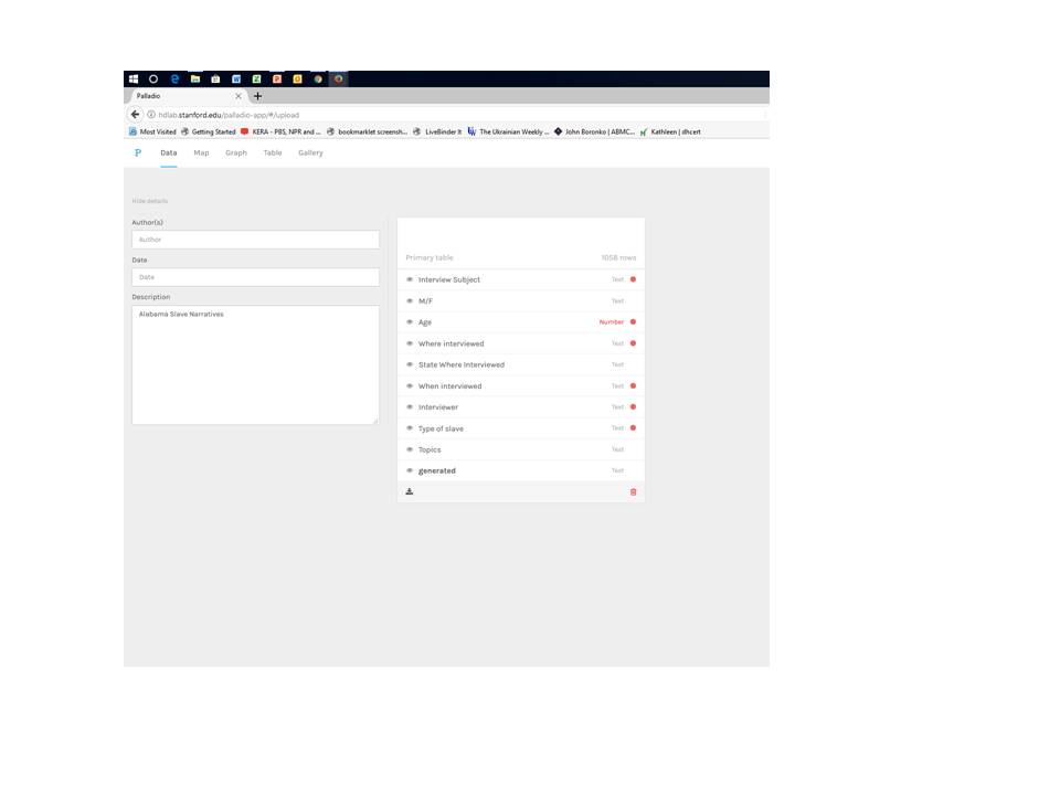
This exercise uses textual data from the Works’ Progress Administration Slave Narratives housed in the Library of Congress. PA Slave Narratives. The collection came together between 1936-1938 when staff of the Federal Writers’ Project of the Works Progress Administration gathered over 2,300 first-person accounts from formerly enslaved people in seventeen states.

Metaphorically, Voyant is set up much like a Swiss Army Knife in that it contains a variety of specialized tools to help the user extract the most meaning out of the data.  However, for ease of introduction, this post will cover only some of the most straightforward default tools.  For any given word, Voyant is able to:

  • visually represent the word in a cloud and express word frequency numerically by scrolling over any given word. This is the default CIRRUS view.
    • By clicking on the TERMS tab, the user can see a list of the terms in the CIRRUS with counts and trends.
    • By clicking on the LINKS tab the user can visually analyze the co-relationships of words.
  • easily locate any given word in a comprehensive list of the places in which it appears in context throughout the larger corpus. This is called the CONTEXT view.
  • explore words in the larger context of a document and see the size of the document in relationship to the corpus. This is called the READER view, and it allows the user to see where in the document the word appears.
  • graph word frequency (raw or relative) over the corpus or in only one document. This is called the TRENDS view, and it also allows the user to change the type of graphs.
  • compare information about the documents as each relates to the corpus including relative length, vocabulary density, distinctive words, etc. This is called the SUMMARY view.

To begin, open up Voyant in a web browser.  For shorter amounts of text like a political speech or magazine article, one may copy and paste text directly into the window.  Larger bodies of text may be uploaded directly from a file or from URLs containing text files. Clicking REVEAL will open up the Voyant default tools described above.

Moving the cursor over this area reveals several functionality options detailed in the next image.

Each tool panel allows the user to toggle back and forth between functionalities.  For example, the CIRRUS tool also allows the user to view the data by TERMS and LINKS.  And, each tool panel allows the user to export data, change tools or define options for how the tool is being used.

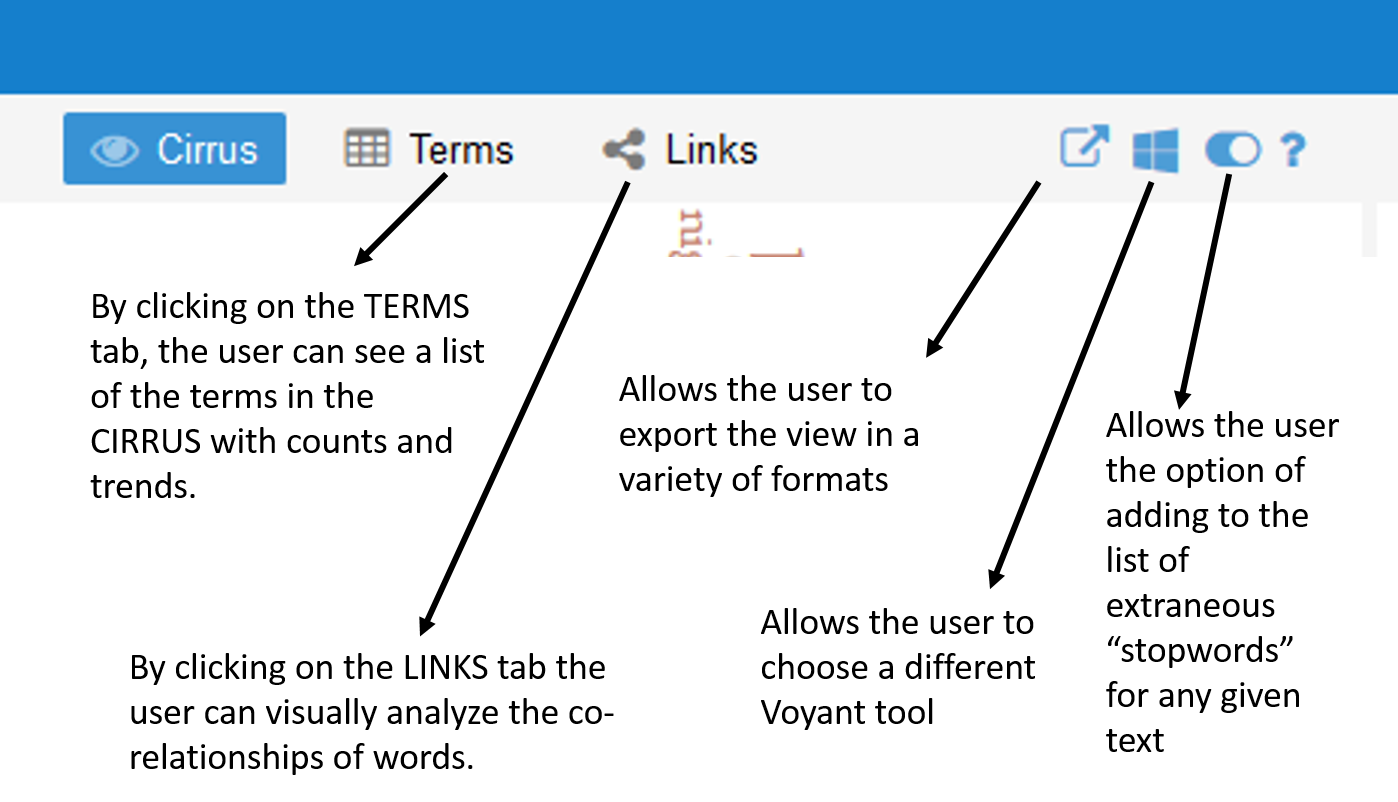
A close up of the functionality options revealed at the top of each tool panel.

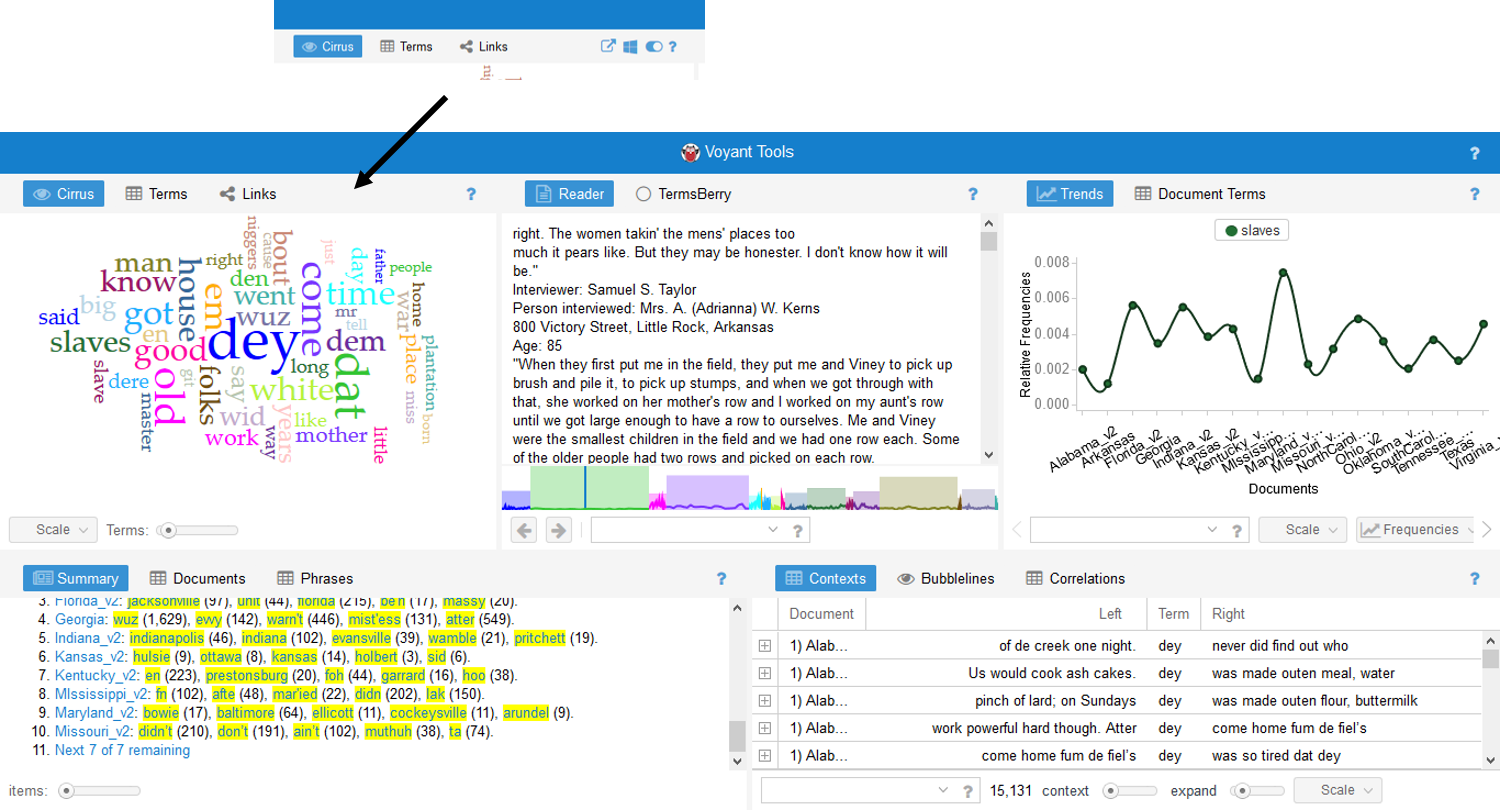
Exploring the CIRRUS tool, the user can now see a visual representation of word frequency.  The user may change the SCALE of the information by applying the tool to the entire CORPUS or to only one DOCUMENT.  In the case of this visualization, the DOCUMENTS are categorized by state.  The user may also broaden the number of TERMS shown in the CIRRUS view.  Clicking on the options button allows the user to remove extraneous stop-words.  In this case colloquialisms such as ain’t have been removed in addition to words such as is and not.

Certainly, many of the words highlighted in this word cloud should make viewers uncomfortable.  And, at least one of these words has come to the fore in the media this week when a school district in Mississippi removed To Kill a Mockingbird from its eighth grade curriculum.  As a teacher of literature and history, omitting this powerful work makes me uncomfortable and profoundly sad.  However, using tools like Voyant in analyzing the language of the 1930s slave narratives could help readers to understand the historical context of why Lee chose to include this word in her novel about racial and social injustice.

Noticing that many of the words reveal a connotation to a person’s place in the community, I chose to analyze the words people and folks to study how the interview subjects’ description of themselves or others was related to geographical differences in dialect. Looking at the cirrus, I am able to see that people is used 2,667 times and folks is used 5,843 times.  I am also able to view commonly linked words such as church and white.

Across the corpus, the states of Maryland and Kansas seem to have a high use of this word. However, in exploring the data in the reader view, it becomes evident that the number of documents for each state is relatively small compared to the larger corpus.

The TRENDS view shows a high relative frequency of the word “folks” in the documents from Maryland and Kansas. However, by looking at the colored graph at the bottom of the READER view, the user is able to understand that the size of the Kansas and Maryland documents are relatively small in relation to the larger corpus.

Using the TRENDS view Voyant is also helpful in analyzing raw frequency vs. relative frequency across the corpus.  The word  people  also appears relatively frequently in Maryland and Kansas.  The READER view has helps in understanding that these data sets are small. However, the body of data for South Carolina, the third most common place the word is used, is much larger, and in analyzing the raw frequencies of the use of people within that particular document, the word seems to be somewhat more consistently used.

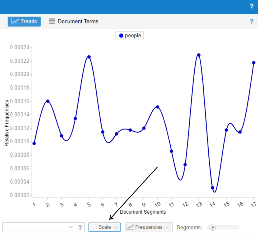
Trend graph of the use of the word “people” in South Carolina. To do this, click on the SCALE button and toggle the selection to reflect a particular document (South Carolina) rather than the entire corpus.

Thus, this shows that that the initial visualization of the word cloud is helpful for highlighting words but that it is important to dig down into the data for each word before drawing conclusions.

The SUMMARY and CONTEXT tools are helpful in finding the unexpected.  For example, the SUMMARY tool allows the user to discover distinctive words in the documents.  By looking at these words in the CONTEXT tool pane, the user can determine if they are place names, family names or unusual colloquial terms such as the   the words pateroles and massy from the summary window.   Again, by consulting the READER and TRENDS views, the user can see that pateroles only seems to appear in the text from Arkansas; however,  the use of the word seems to be fairly well distributed across the document.  One can also glean from the READER view that pateroles is a colloquial expression for patrols meant to constrain the movements of slaves within the community.

The word “pateroles” in the TRENDS view showing frequency almost exclusively in Arkansas.

Thus, these features help the user to find something that wouldn’t be inherently apparent by initially looking only at the word cloud.  They help the user to look more carefully at the document without having to wade through the entire corpus in order to discover something unexpected – a word that wasn’t initially on the radar – and is perhaps far more interesting than the initial search question.

Voyant is a powerful tool, but it can sometimes be a bit unwieldy in terms of exporting data.  I found taking screenshots of data images was far more efficient than trying to export URLs or embed codes for data points that were buried more deeply in the data.  Working with it directly on a desktop in order to explore data might be more efficient, though it is not as effective in publishing data than can be manipulated by others.

All in all, Voyant seems to be an effective tool in helping users understand and compare texts.  As a teacher, I may explore how it could be used to analyze language in political speeches as part of a unit on persuasive language in the context of a literary study of Animal Farm.  And, as mentioned above, the tool could be used on a basic level to help students dig into primary source documents to understand colloquial language in texts like To Kill a Mockingbird or The Color Purple.


Capturing Digital Content

DIGITAL CAPTURE

The practice of digital capture is central to work in digital humanities.  However, implicit in the very definition of the word ‘capture’ is the idea of something being taken by force.  While digital humanists aren’t out wielding weapons against librarians and museum curators, claiming digital preservation as a means of replacing collections, they are, in fact, forcing objects from one medium into another.   

William Heath Robinson Inventions – Square Pegs into Round Holes From the Book: William Heath Robinson Invention, Public Domain

This is not a change from the material world into the immaterial – quite the contrary.  Both mediums, analog and digital, have materiality, but the rules that govern each materiality differ. Thus, the process of digitization can inflict varying levels of trauma on the object being captured.  In forcing a square peg into a round hole, some of the qualities of the object may be lost in order to make it fit.  It is the job of digital humanists to fit as much as possible of the original into the digital circle and to attempt to preserve what is lost in translation as best they can using metadata and supporting information.  Digital humanists must balance the costs associated with this remediation in considering what to digitize and by what method. 

SENSORY ISSUES

Sensory information is often the largest category lost when an object or text is digitized.  Obviously, the taste and smell of an object are almost impossible to capture.  Digitization best captures material that can be imaged or recorded; however, even these capabilities are limited.  Take for instance, sound recordings. 

Once upon a time symphonies were only enjoyed by those who had financial access to assemble such a crowd of musicians.  Today, metropolitan orchestras have democratized the musical experience for middle class masses, and digital recordings of symphonies are enjoyed by listeners in cars and homes alike. While it is possible to listen to the music, the experience of being part of the audience at one place in time cannot be duplicated.

Does the modern listener fully understand the performance in the absence of the atmosphere in which it was originally performed?  Certainly not.  Does an A/V recording of a contemporary symphony performance adequately capture the emotional response of the listener seated adjacent to the camera, or is it trained only on the performance?  Is there something lost there?  Yes.   Despite these limitations, the recording  clearly has value even though some of the richness of the experience is lost.  

Nevertheless, sound recordings can be incredibly valuable as a tool for digital humanists.  Creating digital repositories of dying dialects such as the Texas German Dialect Project preserve data for linguists and historians to study long after the language may have passed into oblivion.  And, projects like StoryCorps offer opportunities for everyday people to add to the historical record. 

Francesco di Antonio del Chierico (Italian, 1433 – 1484) Music Text, third quarter of 15th century, Tempera and gold on parchment The J. Paul Getty Museum, Los Angeles

In a similar fashion, two dimensional images can capture a view of a three-dimensional object, but the material experience of the object will be incomplete. Visualization seems to work best for objects that are somewhat “flat” to begin with – think texts versus statues.  Yet, even in the case of digitizing a page, the reverse side will always be left out.  Items photographed in isolation lack scale, and weight and texture are difficult to assess.  Video can help to solve these problems, but it still does not accurately capture the weight and texture of the item.   Certainly, multiple angles, high-res images, proportional benchmarks or texts can help with these problems.    Advances in imaging such as 360° views, panoramas and augmented reality may strengthen visual digitization as tool.  However, these processes are cumbersome and can be expensive to produce, creating a volume of data that is expensive to maintain over the long term.   

In many cases, visual digitization of objects can positively enhance how one interacts with an artifact. Details may be more readily seen because viewers can zoom in on a particular section.  Archaic manuscripts that are not able to be handled physically for fear of degradation may be digitized and studied on a broader level.  Individual pages from a volume of works may be read in a way that would be impossible if the volume were housed inside a glass case in a museum.   

CHALLENGES

One challenge in working with textual digitization is the difference between an image of a text and text that has been processed through OCR (Optical Character Recognition) or rekeying (human visualization). Rekeying and OCR make visual copies of texts searchable by word.  Rekeying is time consuming and can be cost prohibitive without using techniques such as crowdsourcing.  Computer generated OCR is faster and less expensive in theory, but it is a classic example of a process when digital capture inflicts harm on its subject.  Because the software is not perfect, even slight imperfections in character recognition can confuse meaning within a text.  In reading texts such as recipes where precision is required, misreading ¼ as 4 will change the outcome entirely. 

Like in traditional methods of preservation, funding and foot traffic remain important for keeping the collection relevant, whether it exists in analog or digital form.  And, to a large extent, interest plays a huge role in what is collected.  Some communities are more open to digitization either culturally or financially; therefore, the data available for study is largely dependent on the groundswell of support that exists for that data set.   

OPPORTUNITIES

While digitization does not substitute for traditional methods of preservation, it does have its place within the humanities community.  It can preserve a form of an object or text against total loss, and it can in some ways enhance the accessibility of objects and provide more detailed views than would ordinarily be available.  Digital collections may be assembled virtually from collections across the globe. 

Unknown Denarius, 1st century B.C., Silver 0.0039 kg (0.0086 lb.) The J. Paul Getty Museum, Los Angeles

Digitization has become  a powerful force in places like the education community. As a secondary level history teacher, I have been able to bring a wide array of artifacts into the classroom.  I am able to gather digital images of Roman coins to use in creating DBQ (Document Based Question) activities for my middle school students.  Students can examine these rare coins and zoom in on details using their iPads thanks to the Open Content Program at the Getty Museum.  Digitization makes it possible for them to work with content in ways that would have been impossible only ten years ago.

Denarius of Julius Caesar, Adams Family Collection

But, nothing will ever substitute for the ability observe the real thing, and in the case of my students, to actually hold a similar coin in your hand.  The family of a former student graciously allows me to borrow his great-grandfather’s collection of Roman coins each year. Touching and, yes, even smelling it, students stare in wonder as they consider all the pockets and places the coin has traveled in its two millennia of existence.  I am a lucky teacher to have access to both the analog and the digital versions of this ancient artifact.  While the digital will never replace the real thing, it can enhance access to a broader group of people and enhance the ability to look carefully into the past.