Public History

A Right to the City Digital Exhibit

Built using ArcGIS StoryMaps for the Smithsonian Anacostia Community Museum

I am excited to share that my internship work creating a digital exhibit using ArcGIS StoryMaps for the Smithsonian Anacostia Community Museum is finally live! Check out A Right to the City and learn about ordinary Washingtonians who shaped and reshaped their city in extraordinary ways.

Walking Through History in Public Part II

Last fall I was fortunate enough to visit the Chinese Historical Society of America in San Francisco.  William Tran, the Education and Programs Coordinator, led my teacher group on a walking tour of Chinatown.  It was fascinating to observe all the layers of story as he explained the evolution of Chinatown through its architecture and changing landscape.  He held up documents and photos that helped us to see the changes in the landscape over time and to understand the ways that urban pressures are rapidly eroding the cultural heritage of the community.

Later in the trip my family joined me, and I tried to duplicate the experience using a paper tour map that William copied for me. I was not a successful tour guide.  I was missing his knowledge and the supplementary materials he showed us that enriched the experience.

Recently, friends have visited San Francisco, and I have encouraged them to try to book a tour through the museum.  Sadly, tours are very limited due to staffing shortages.  Thinking about the work of Histories of the National Mall, I have imagined how a mobile history app or website that mimics William’s wisdom, insight and perspective might aid the museum in sharing the rich history of Chinatown and draw people in to connected exhibits housed at CHSA.

While I haven’t used StreetMuseum in the field, I wonder if it might overload the user with content in an already overwhelming environment.  It seems that the challenge of augmented reality is to provide enough information and supportive content to enhance the experience of the user without overwhelming the real world.  While our physical landscape may often be a living museum, it is important to remember that the life goes on as we are moving through it.  A museum is, by its nature, an intentionally designed physical space meant to constrain the user’s experience of an environment.  Signage, user guides and docent tours augment that intentional space.  It seems that one of the challenges of augmented reality is how to design virtual signage, user guides and docent tours in a way that are supportive for its user and do not stress the user with information overload.

While my project isn’t really tied to an augmented reality environment, I wonder how I might design an experience for visitors to the CHSA as they walk though the museum’s exhibits and out into the physical landscape that inspired them.  In my mind, less may be more, but I would make sure that the content I did create would enhance the user’s focus and security in the environment in order to generate meaningful understanding about how an environment changes over time.

Walking Through History in Public


I used Clio to locate the Downtown Dallas Walking Tour.  To call this tour a mobile history site is a generous term.  While it does guide the driver or pedestrian on an 18 stop tour of downtown, it leaves a great deal to be desired.  The page layout is not sized to fit the mobile device, and many content items appear on each page.  One must navigate down to the bottom of the page to click to the next stop on the tour.  It does provide an audio guide, but it is simply a computer narrator voicing the written text.  While it keeps the tourist from having to read the information, it only provides place by place information.  Walking directions aren’t included.  One needs to follow the link on the Google map embedded in the page to get walking directions. This requires one to flip between apps and uses data to maintain a connection to the landscape.

Another drawback is that the information presented would be just as useful viewed from a desk as from being in the field.  The content is in no way connected to helping the user contextualize being in the landscape.

In sharp contrast is the Rick Steves Audio Europe Travel App that I have used in many cites while on research trips in Europe.  Rick Steves is an author and tour guide who has made a name for himself on public television and beyond.  While he is not what many would call a public historian, his reach for popularizing European history is extensive. Steves does local community history but on a continental scale.

The app is free and contains walking tours of hundreds of sites (museums and historic city walks) Steves has written about in his many publications.  Users can download the app and episodes before they go to Europe to avoid expensive data usage fees.  A vivid photo bookmarks each stop on the audio tour as Steves literally walks the user through the physical landscape, pointing out details with an engaging narrative.  Accompanying PDF maps that simplify the landscape help to place users in the physical space.  Steves’ excellent directions guide readers not only to take in a particular site but between sites as well.

While I realized that the scope and resources that have produced these two sites vary to extremes, I think it is important to note what it is about the Steves experience that works.  It is simple in its design and rich in content; however, that content is very focused on the audio experience.  Steves doesn’t expect users to engage their vision on the screen; he wants them to engage in looking at the history all around them.  Users are literally in the museum, and he is the docent.


Project Update Part II

This week I accomplished the task of migrating all of the items from the original archive to the new Omeka section of the Weaving Our Story integrated platform.  I opted to move the items over by hand instead of figuring out the export/import feature in Omeka.  While I am sure that is a possibility, I didn’t want to waste valuable time figuring out the Omeka process through trial and error.

Looking back, the process of moving the items over manually took far more time than I thought that it would, but the process had a hidden benefit.  In having to look at each piece of metadata individually, I was able to detect errors that I had made as a novice metadata technician and to correct them.  Because I have added items at different points in the process, I could also see that my metadata strategy changed based on the collection I was drawing from and the progress I had made in the course.  I recall an earlier reading from the program noting how metadata, which should seemingly be unbiased, invariably reflects the institution or individual creating it.  This was apparent in going back through several iterations of gathering information.

I find the concept of “progress” on this project to be a bit illusory.  While I want so much for there to be visible process on the front end, I am beginning to realize how much work goes into creating a sustainable project from the back end.  I now realize the importance of creating an organized system for naming files, housing them on network drive in an organized fashion and keeping a separate document or spreadsheet that keeps track of everything.  However, without a consistent plan for the details, what people see on the front end may be muddled.

Now that I have the details sorted out, my goals for this coming week are to continue to work on permissions releases and to begin to play with how the refreshed archive can be re-imported into the Scalar site in order to create a web of exhibits.

OHMS

Having played around with transcribing oral histories manually, I recognize that it can be a time consuming effort.  Using transcription tools like Transcribe or oTranscribe can enhance the process by slowing down playback when typing.  Both of these platforms, along with the Voice Typing feature in Google Docs, feature the ability to speak text instead of typing it.  Just listen to the audio and speak back what you hear.  The computer does a fairly adequate job of transcription this way; however, it does not work well when playing back the audio directly into the computer’s microphone.  It seems that a human intermediary is still necessary.

However, when all is said and done, the end result is still only a transcribed interview.  According to Doug Boyd of the Louie B. Nunn Center for Oral History, the cost of transcribing and auditing an hour long interview can reach $200. To make the interview useful, it would still need to be processed to include an index correlating topics to time in the interview.  This is where OHMS helps to streamline this process by improving search functionality within the interview and does so more efficiently.

First, OHMS can quickly create an encoded transcript of an interviews so that the connection between a keyword and a time in the video are easily accessible.  OHMS also features a viewer so that the encoded transcript can be more easily manipulated on the front end.  Furthermore, OHMS can streamline the process of transcribing the interview by aiding in indexing content rather than fully transcribing it.  While transcription is still the goal for most oral history repositories, the high cost of generating a fully audited transcript can quickly drain resources.  OHMS makes indexing more efficient so that the cost for a graduate student to process an interview is around $30.

I would like to keep this tool in mind as an option for processing my father’s taped memoirs as a gift to my family if it is possible to use OHMS as an open source tool on my own at some point in the future.


Project Update – Keeping Up With the Details

This week has been a busy week for Weaving Our Story 2.0. In terms of adding to the archive, students are neck deep in the final stages of research.  Notable stories from this year include a connection to the U2 Incident and a Russian Jew who fled service in the czar’s army only to become a highly decorated soldier in the U.S. Army during both World Wars.  Another student is working on telling the story of Cambodians fleeing the brutal regime of the Khmer Rouge.  Wrestling with the question of history, memory and commemoration, a young historian is unpacking her connection to a distant relative honored for her ‘bravery’ during King William’s War. Using the Raid on Deerfield resource has helped her to understand this time period from a variety of perspectives.   Finally, another student is solving a history mystery as she and her grandmother try to attach meaning to a disparate set of photographs and artifacts from German and American soldiers collected during her great-grandfather’s service in the 70th Infantry Division during World War II.

Students have been encouraged to bring in photographs, letters and other objects to photograph for use in the documentaries, and I plan to use them alongside the films as additional resources in the archive.  I also plan to use this material as part of a lesson on the concept of metadata and how their desire to constantly “search it up on Google” really works.

As far as the digital project goes, I have spent a good bit of time figuring out logistics.  I’ve adopted a new domain for the revised project to make the archive, blog and scalar site seem to work in a more unified fashion.  However, I need to migrate the items in the original Omeka archive into the new one. This week I cleaned up the metadata in the original archive and tried to mirror/tweak the set up for the item metadata in the new archive to be ready to receive the content.  I am aware that there is a plug-in to do a bulk upload into Omeka, but there doesn’t seem to be a simple way to export the data from one Omkea archive to another that I understand.  I’ve looked through several forums, but again, it seems to require more “back-end” know how than I have.  I decided it will be simpler and less time consuming in the long run to migrate the items and metadata one-at-a-time using the tried and true method of “copy-paste” while both the archives are open on linked monitors.

My biggest priority for the coming week is to finally concentrate on obtaining signed permissions statements from students whose work I used in creating the first archive and exhibit.  The school attorney was slow in getting on this so I secured verbal agreements first.  My second priority is to reach out to the Class of 2018 who will be graduating in only a few weeks.  I probably have the most chance of success of securing permissions from them since it is still a face-to face relationship.  I also need to reach out to parents and students of alumni in order to secure permissions from students who have already graduated; however, I realize this may be less fruitful and require more time.  Keeping track of contacts and permission form records in an organized system is also a priority.

While I feel hopeful that the structure and design of the digital project will work, I am also beginning to realize that project management is a huge issue.  The project is complex both in the resources that students are using to compile their films as well as in how the various platforms work together to present those assets.  They will need to create metadata for their items, and I need to design a streamlined, pre-populated Google form to help them keep the metadata “clean” for the archive.  The project is complex in the number of items and permissions I need to secure to build the digital project, and I need a system to manage all of these things on an ongoing basis.  I feel a bit like I’m with Harry Potter in the Gringott’s vault looking for the right horcrux, only to realize that each item replicates itself each time it’s touched.  I may be drowning in the details.

Family History in Public

As Tammy Gordon writes in Private History in Public: Exhibition and the Settings of Everyday Life, one of the characteristics of community history projects is that the “exhibits emerge from curators whose identities are profoundly informed by the history presented in the exhibition” (36).  In contrast to exhibits driven by an academic desire for a more balanced treatment, community history projects are inherently tied to a desire for its consumers to appreciate the perspectives and voices of the local community, as the community understands itself.  Gordon notes that exhibits emerge from the work of curators for whom “the historical subject profoundly informs the[ir] identit[ies]” (38).

This concept operates at two different levels in the Weaving Our Story project.  As documentarians, my students are profoundly connected to the stories of their grandparents and the perspectives they offer.  While students do place those perspectives in a larger historical context, the goal is not to offer a counter-point to the grandparent’s experience but to locate it within the historical record.  For example, one student has documented her grandmother’s experience in an internment camp in Indonesia during World War II.  While she frames that story within the larger context of World War II, she does not dig into the Indonesian resentment of Dutch colonizers and who first welcomed the Japanese as liberators.  Granted, these are short documentaries completed by seventh grade students, but the point remains that the “exhibit builder” (in this case, my student) is greatly influenced by a desire to extract empathy for her grandmother from those who view the film.

On a similar level, Gordon observes the bind that local history curators face in maintaining positive public relations in order to obtain the volunteers, recollections and material culture that bring community history to life. Certainly, sensitivity to grandparents’ experiences is an important factor in continuing to generate enthusiasm for the project.  Now that the archive will be digitally accessible, the public permanence of the project will make it increasingly important to be mindful of community history resources while maintaining the project as a vehicle for practicing historical thinking skills.

This article has also helped me to understand the nuances of community history, especially as it relates to its unique goals.  As Gordon notes, the goal of community history is not necessarily to contribute to a scholarly dialogue but to communicate “their interests to outsiders, connecting elders to young people [and build] a sense of shared past . . . . ” (39).  While students may be curating content in a manner that shares only one perspective on an event, they are creating a space for practicing historical thinking and for historical conversations to occur.

In regards to the overall design of the digital site, Gutterman shares important lessons learned from designing outhistory.org.  She corroborates the strategies discussed in earlier modules that incorporate generous visual interfaces by noting that the site’s traffic tended to gravitate to pages with large images and away from pages that were textually burdensome.  Additionally, complex search features may have overwhelmed visitors to the site who were more comfortable with a more simple approach.  In the same way community history curators may be influenced by community identity, digital history project designers may be influenced by such familiarity with content that they may design experiences that are too complex for a first time visitor to a project.

A final observation relates to Gordon’s reminder that one goal of community history is to draw people to a place for the purposes of tourism.  Billboards draw turnpike travelers toward local museums and attractions.  In a similar fashion, promoting a robust social media strategy and creating intriguing design elements are critical to generating traffic to digital community history projects.  However, historical societies also have a role to play.  The vast array of projects digitally curated by the Minnesota Historical Society is a good example of how local projects could get lost without “signage” directing users to the sites.  Many of the projects were fascinating but would not have turned up on a Google search of a particular topic because one wouldn’t necessarily know that thread of community history existed in digital form.

__________________________________________

Gordon, Tammy. “Community Exhibition: History, Identity, and Dialogue.” In Private History in Public: Exhibition and the Settings of Everyday Life, 33-57. Lanham: AltaMira Press, 2010. Gutterman, Lauren.

“OutHistory.org: An Experiment in LGBTQ Community History-Making.” The Public Historian 32.4 (2010).

The Devil in the Details

Modules 4 and 5 have been incredibly helpful in guiding my thinking about my project as I revise Weaving Our Story both structurally and conceptually.  The original version of the project was initially conceived only as an archive, and the exhibit features were added as an additional requirement.  The process of creating both the archive and the exhibit did not include a deliberate process for strategically planning either of those features in advance. Working through these modules has helped me to rethink the entire project as I design it for specific audiences, taking into account how a particular persona moves through the site as well as crafting content to elicit engagement.

Structurally, the archive is based on a textual search.  However, if a person is unfamiliar with the contents of the collection, it will be difficult to know what terms to search.  As Sherratt notes, “recordkeeping systems tend to reflect the structures and power relations of the organisations that create them.”  I was completely familiar with the particular terms the user should type into the search box; unfortunately, the user might not be as familiar.

Though some exceptional visitors to the site might successfully find films in a search using keyword tags, these results would not be curated in a way that would highlight the connections evident to a person more familiar with the collection.  A “successful” search might result in three or four related films being trucked out into the lobby (to borrow a metaphor from “Generous Interfaces for Digital Cultural Collections”) for the individual to view; however, the search results would lack any kind of contextual information to elicit deeper understanding for the viewer.

In order to overcome this deficiency, the original site assembled selected films into exhibits with accompanying text and questions.  However, these curated exhibit pages relied heavily on Omeka’s default interface.  As a result, the tool was driving the way searches were conducted as well as the way exhibits were curated.  The goal of this project is to turn that situation on its head.  Instead of the tool driving the process, thoughtful planning is meant to drive the project toward the right tool (or tools) and to curated content that is purposeful.

Both “Generous Interfaces for Digital Cultural Collections” and “It’s All About the Stuff: Collections, Interfaces, Power, and People” emphasize the importance of ways that communicating visually rather than textually can invite a higher and often more successful degree of interaction from the user.  Having a robust visual interface both in creating exhibits and in conducting searches are key features I want to include in the revised Weaving Our Story project.

In thinking through the purposes and audiences for which I am designing, I have come to understand that multiple tools can be used for various purposes.  While Omeka is still a good choice for archiving the large number of items the collection will eventually contain, it is not a useful platform for designing the level of visual engagement my project needs.  I have created a new domain with a cleaner name – simply weavingourstory.org and will use subdirectories for each individual tool.  At this point, I have not migrated the Omeka items from the original project site to the new site because I want to spend some time adjusting the metadata to insure accuracy.

After doing some research, I landed on SCALAR, a publishing platform that has a diverse collection visually appealing pages designed with a variety of purposes in mind.  One of these pages allows me to assemble a more generous interface for my inquiry level search creating a collage of selected items in the collection.  I am able to import the items directly from the Omeka archive by enabling the API.  This allows the items to be exported with their metadata intact.  Instead of typing a key word, the user will click on a visually engaging picture that will draw her into a curated exhibit page.

However, instead of the exhibit pages driving the layout of the site as they do in Omeka, Scalar’s set up allows exhibit pages to weave together more organically, much like a network visualization might do.  And, like the manner in which the Invisible Australians project blends a Zotero site into the navigational links, my project will incorporate a WordPress blog for teachers in a different subdirectory.  Though I am using three different tools, each blends with the other to create an overall look of cohesiveness.  Downloading the Customeka theme helped me to design the Omeka archive to thematically mirror the look of Scalar.  WordPress offers a variety of customizable themes that also mirror the look of Scalar.

Once the structure is in place, keeping the message on point and specific will be critical to making sure the site is engaging once the viewer has been drawn into using the visual interface.  The text does matter at this stage of the process, and making sure that the content delivers a clear message to a target audience appropriately is critical.  Keeping the content concise and focused will help the audience to maintain interest.  As Fisher notes, managing the scale of project is critical to preventing boredom and overkill.  Finding a balance is critical.  With more careful planning the second time around, my aim is to build a better project by ensuring that the foundational principles are rooted in sound practices of public history.

Co-Creation and Doing Digital Public History

This module has been particularly helpful.  My project began with an idea about doing oral history documentaries with students years ago.  As the project went on, I realized that archiving the projects would be a worthwhile endeavor.  Finally, I was able to create that archive last semester.

However, I have realized that the project that I created was not well-planned and only included my own vision for the project.  As I have been mulling over ways to improve the project in my elevator speech, I continued to engage in this one-sided thinking.  I knew my own internal dialogue for my own vision for the project.  However, I hadn’t considered how others might view the site or its potentialities.

By having a dialogue with multiple colleagues who have expertise in a variety of disciplines and perspectives within the school, I realized that many of the flaws I saw weren’t as bothersome to them.  More importantly, I found that my vision for how the site might be used might weaken its effectiveness.  Finally, I learned about others’ perspectives on how the site might be used differently than I had previously envisioned.

One week ago, the thinking behind my elevator speech was oriented toward how to engage grandparents in their grandchild’s work.  While I still consider this to be an important group to consider, I am not sure they are as important as the foci of my first and second potential personas – prospective parents and other teachers.  I would not have had this perspective had I not had the collaborative dialogue.  While I think that grandparents are an important component, I am not sure they are central to the project.  I would like to have a follow-up conversation with an additional colleague who has a unique perspective on how the relationship between the school and grandparents functions.

Public history is by definition “public” in nature.  It is important not to forget talk with the public in designing history projects rather than only talking at them when it is time to deliver the project to them.  I’ve learned a valuable lesson in asking questions and doing so in person.  In this way the conversation is truly dialogical instead of an exercise in question and response.

Good teaching is about engaging in a push and pull with students; good public history should be, too.

George W. Bush Presidential Library and Museum: Physical and Digital Spaces

Argument, Design and Interpretation

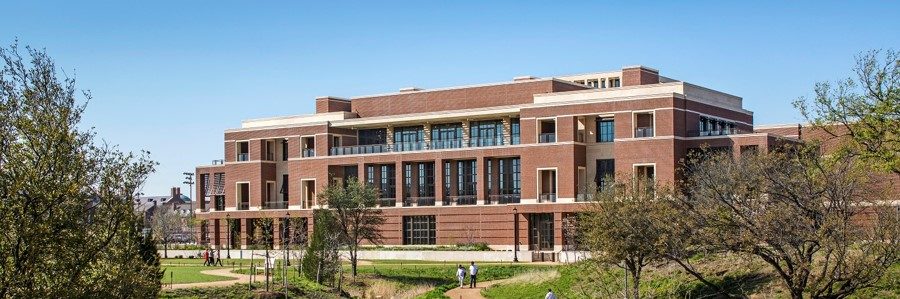
The George W. Bush Presidential Center opened in 2013 on the campus of Southern Methodist University in Dallas, Texas.  The facility houses both the Bush Institute, a nonpartisan policy organization and the George W. Bush Presidential Library and Museum.  The National Archives and Records Administration operates the George W. Bush Presidential Library.

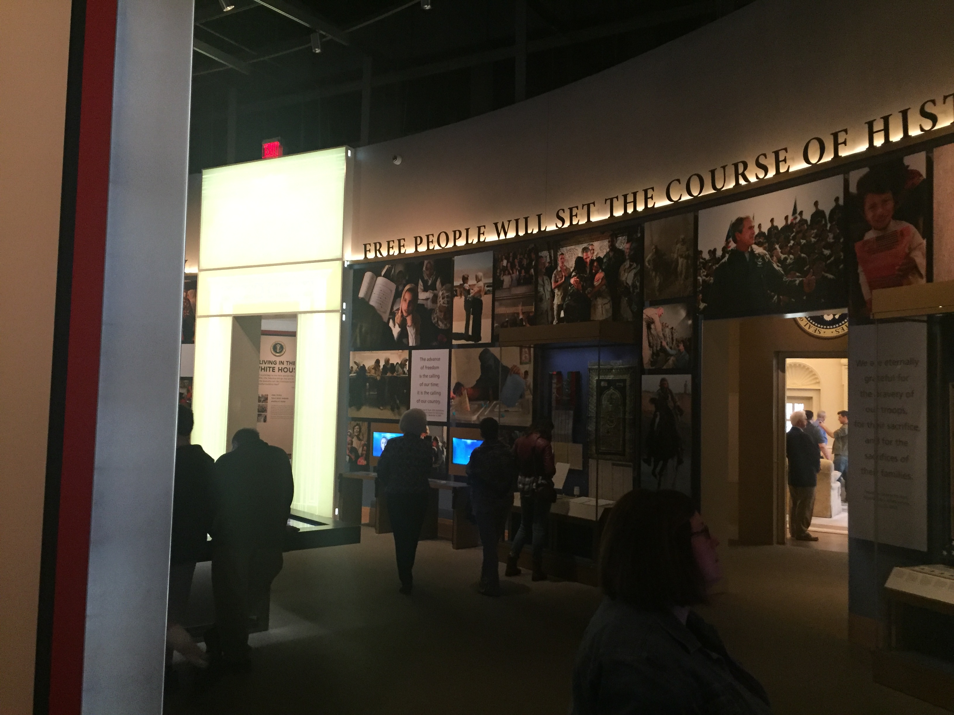
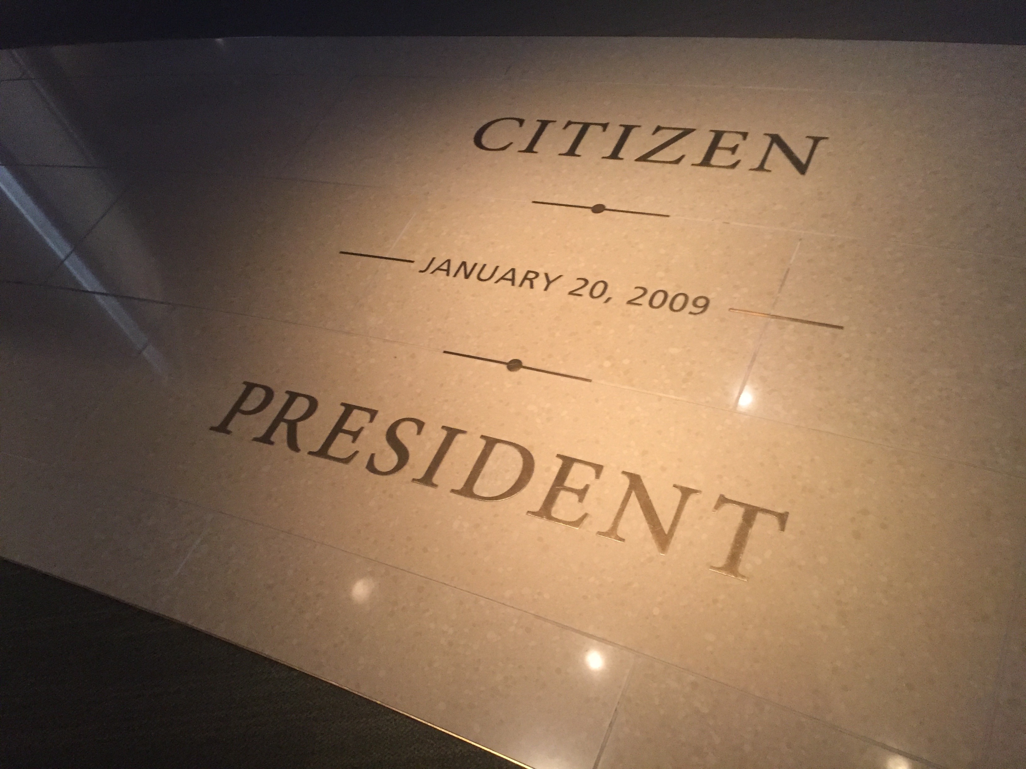
Before entering the permanent exhibit, visitors view the multi-media film on the enormous LED screen in Freedom Hall.  The visual symbolism of the display is meant to contextualize the role of the People in American democracy, a recurring theme throughout the museum.  A key feature of this role involves decision making and many exhibits are interpreted to examine this process.

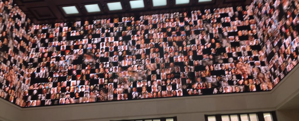
Freedom Hall Multimedia Display

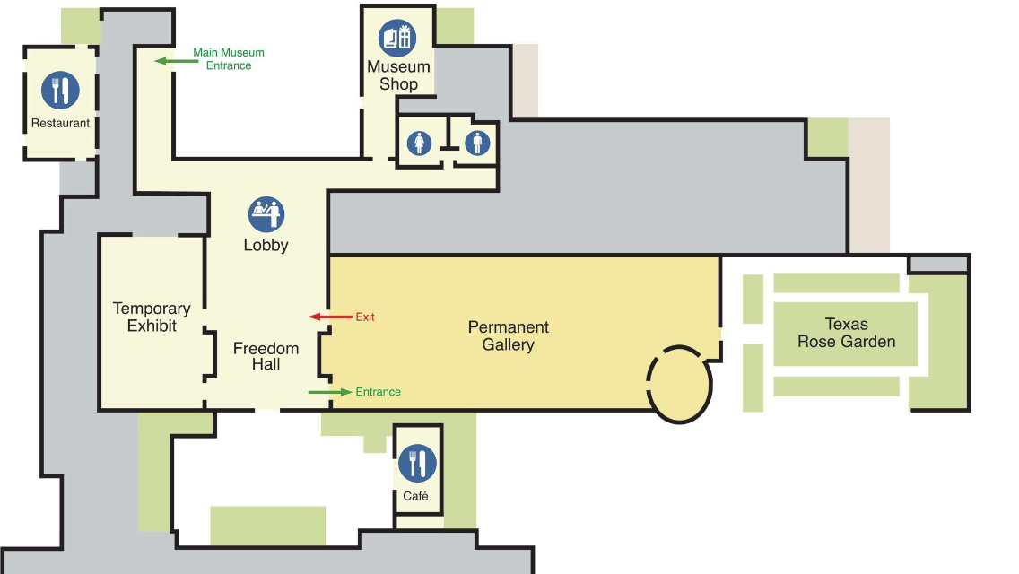
Site Layout, Navigation and Flow

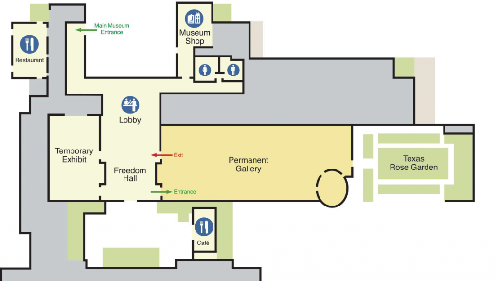
The exhibit build out leads visitors through a generally chronological tour at the beginning of the exhibit.  The Florida Recount, No Child Left Behind and other early policy initiatives precede the 9/11 exhibit which is in sharp contrast to what the visitor has previously experienced.

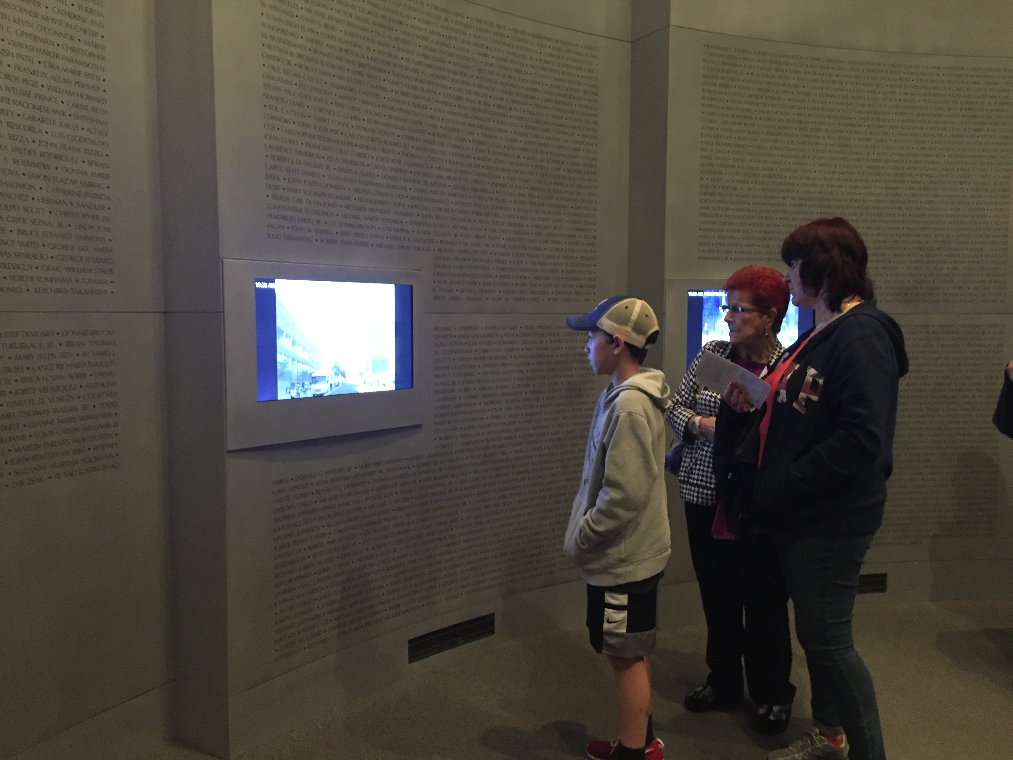
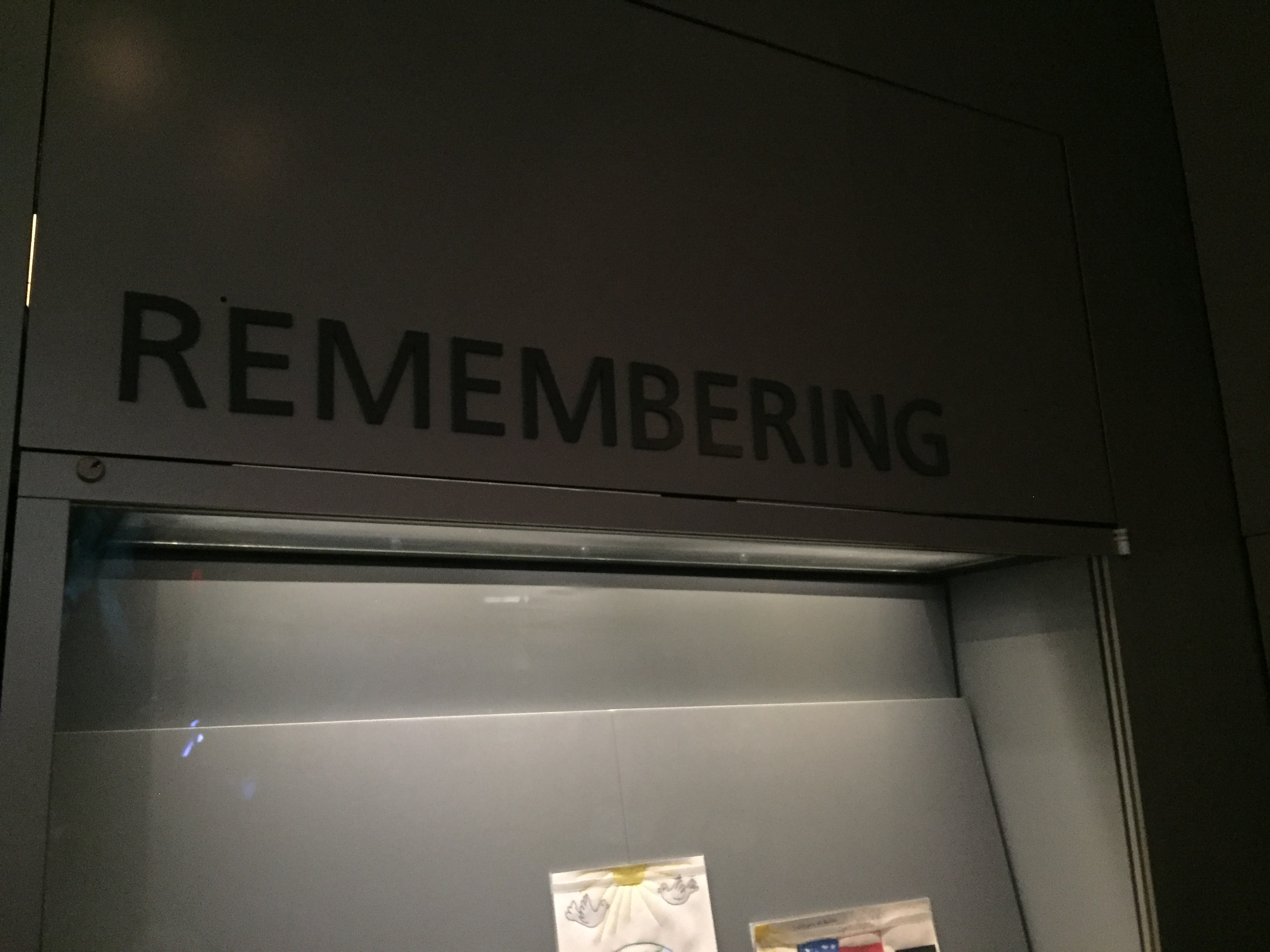
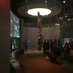
This space is exceedingly well designed in that it presents the emotionally charged days surrounding 9/11 accurately and succinctly.  The visitor can appreciate the blow by blow events of 9/11 itself and the national reaction in the immediate aftermath is recounted as well.  The space is darker and takes advantage of the building’s tall ceilings to emphasize the twisted girder from the WTC central to the exhibit space.

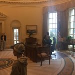
As patrons proceed out of the 9/11 space, they are led around the corner to the left to explore other parts of the Bush presidency. However, a great failing of the exhibit design is that visitors often miss out on one of the most interesting spaces in the museum.  So much so, that upon entering the exhibit, docents are trained to ask, “Have you been here before?  Please don’t miss the Oval Office just past the 9/11 exhibit.” Other than directing traffic, docents did not generally engage with the public.

While visitors are drawn to the left, to the right is an exact replica of the Oval Office as it was furnished during the Bush presidency.  The exhibit is not well marked in connection to the rest of the space. The necessity of having a window dictates where this exhibit lives within the larger layout of the museum so it wouldn’t be realistic to redesign where the exhibit is.  However, greater care could be taken with signage or exhibit design that would more naturally draw people into the space.  While the space is interesting and generates a photo-op, it does not deliver as a highly interpretive space.  This area also leads visitors to some of the lighter moments of the Bush White House.

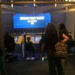
After the “detour through the White House,” patrons proceed through the rest of the exhibit where visitors learn about the President’s African Aids Initiative and the role of dissidents around the world. A large portion of this space is consumed by the Decision Points Theater.  Comparable to the 9/11 exhibit in scope, this multi-media experience is central to the museum’s mission of developing decision making skills as part of civic engagement.

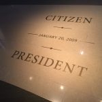
Finally, museum visitors are asked to consider the role the President and First Lady will play after leaving public life through service as citizen volunteers. Visitors are directed toward a kiosk where they can consider a variety of volunteer opportunities and are asked to “Be Citizens not Spectators.”

Audience and Accessibility

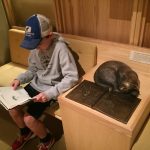
The space does make accommodations for visitors of a variety of ages as well as individuals and families. A seat behind the wheel of mini-school bus and a reading nook draw children into the No Child Left Behind exhibit.  The Life in the White House video game offers opportunities for reflection and collaboration across generations. Obvious care had been taken to make displays, tags and interactives at a viewing level that are appropriate for the physically challenged, children and ambulatory adults alike.  The majority of visitors seemed to be white and middle class and adult.  The museum app provides a Spanish language digital tour for adults and children; however, all exhibit tags were in English.

Communication and Interpretation

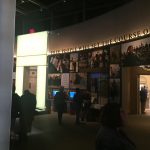
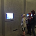
The video screens in the 9/11 exhibit displayed looping news clips of the day’s major events and those immediately following.  While the contextual elements were geared for adults, the video offerings provided an appropriate level of information for older children.

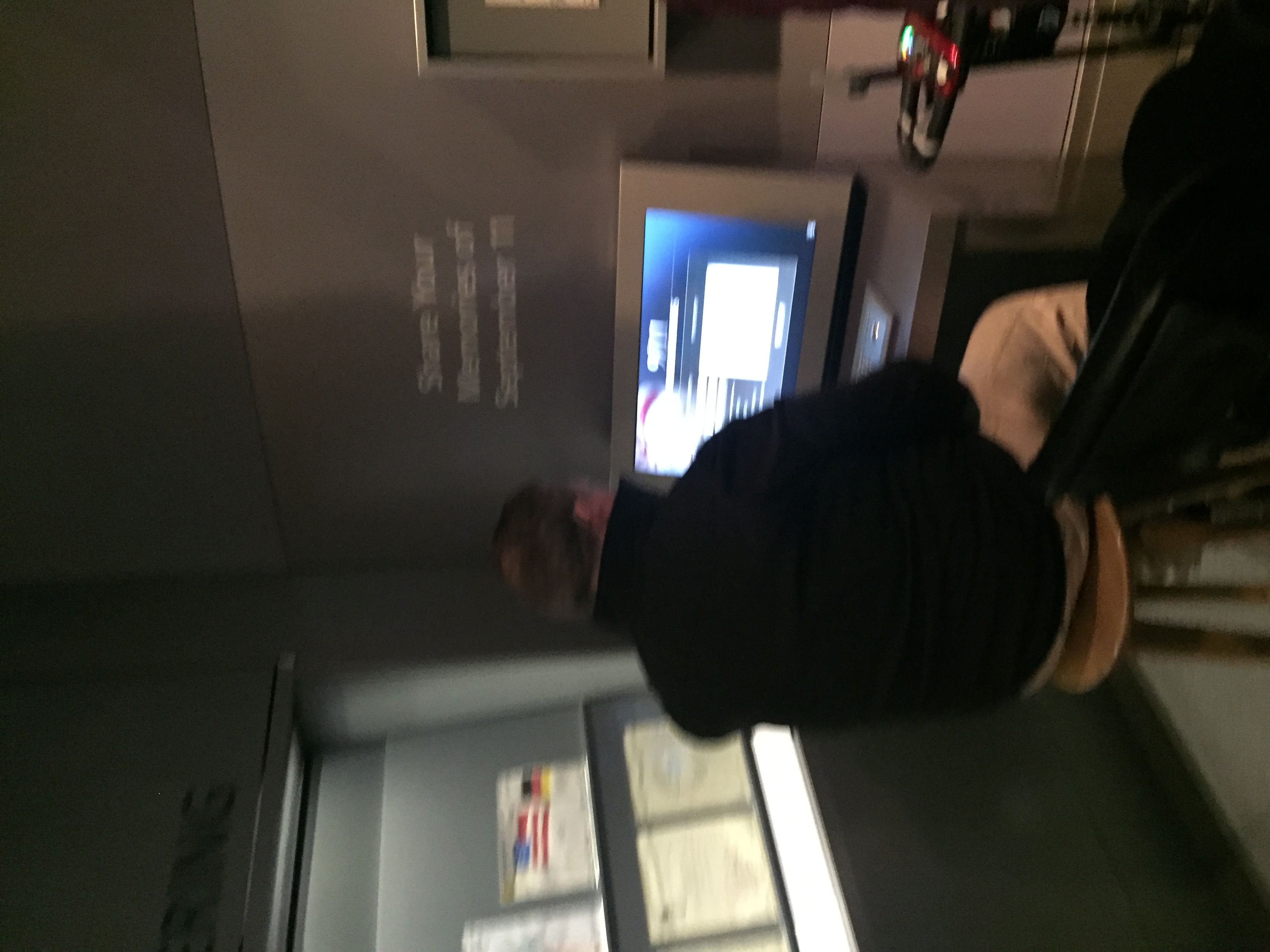
As a repository for the National Archives and Records Administration, the Bush Library and Museum seeks to further that mission by engaging adults in collecting 9/11 stories for preservation in the National Archives.

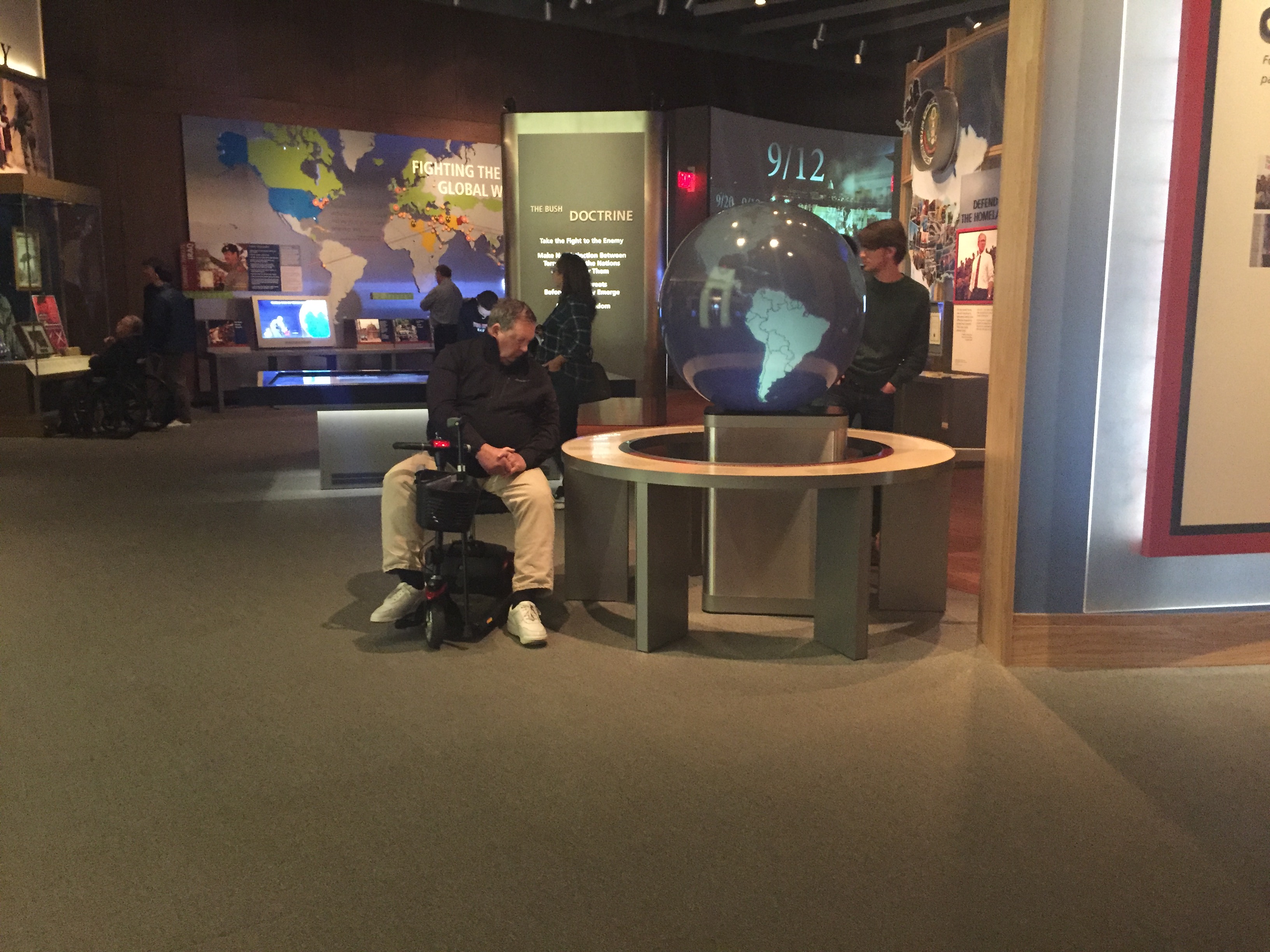
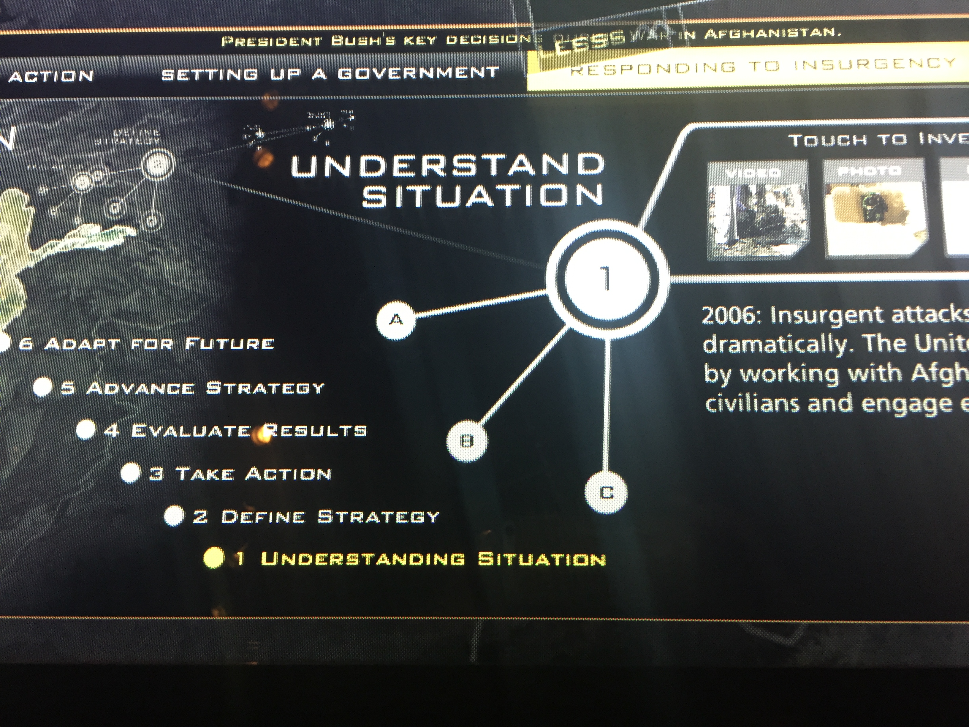
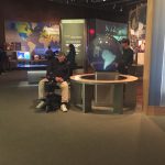
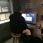
Video touch screens also helped visitors to analyze the wars in Afghanistan and Iraq.  Like many exhibits in the Bush Library and Museum, the learning outcome is focused on the process of decision making rather than the outcome of the decision.  Visitors commented on the “business school” aspects of the decision making process.

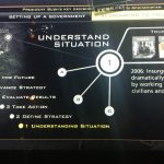
The Decision Points Theater is central to the museum’s argument about the importance of decision making in a democracy.  The object is not only to teach the events themselves but also to help visitors undersand the difficulties of governing in a way that is forward looking.  Throughout the museum, a good faith effort is made not to just to convince visitors WHAT to think but HOW to think about the decision making process as lifelong learners.

The exhibit dissects the thinking behind major crises of the Bush Presidency (Katrina, Iraq, Financial Crisis, etc.).  Participants listen to pro/con arguments from a variety of sources in order to make a decision about how to take action.  Responses are tallied among participants and majority rules.  A video of President Bush explaining his reasoning on the actions undertaken by his administration follows to complement or contrast the decision of participants.  Reviews have been mixed because of varying levels of perceived bias regarding the information presented.  Adults having lived through those times also benefit from hindsight in evaluating the evidence presented.

Digital Media

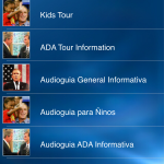
GWB CENTER APP The Bush Center App is part of the museum’s digital presence though it has limited functionality away from the museum.

At the museum, the app contains differentiated tours for adults and children, including Spanish language versions of both.  The Kid’s Tour falls decidedly flat, and the adult tour is bland as well.

The “My Gallery” section encourages visitors to record their museum visit though this requires that the app access the phone’s camera roll.  It is unclear if this is only to connect to photos and videos taken at the museum or if it gives more general access.  This lack of clarity could make some users uneasy.

Finally, the app allows visitors to participate in recording 9/11 stories as well.  In the 9/11 exhibit there is one kiosk where visitors can do the same.  Presumably, the app allows more visitors to access this capability while on museum grounds and without the pressure of “the next person in line” rushing such a personal experience. This is perhaps the most positive use of the app from a participatory standpoint.

WEBSITE The George W. Bush Library and Museum website offers resources for planning a museum visit, links to upcoming events and digital publications as well as links about how to conduct research through the NARA.  It also offers a collection of digital documents, photographs and films.  The collection appears to be interesting, but the thumbnails are hard to navigate and do not include a point of reference in advance of looking at the image. Overall the website is good at delivering basic information, but it is a little unwieldy for someone interested in investigating the museum digitally. The design is generally geared for informational purposes only and does not give much thought to the historical arguments or interpretive choices in the museum itself.

The audience seems first to be potential museum visitors and afterwards researchers and students/educators.  The landing page is generally well organized, though not all of the content is visible on the screen at one time. The site is fairly successful in conveying pertinent and helpful information about museum and research visits. However, because the site is linked to outside NARA resources as well as resources of the George W. Bush Presidential Center, the flow can be a bit unwieldy.  The information for teachers and students is also unwieldy and gives off the feeling that the content was hurriedly created to “cross it off the list” in museum planning without any thought to overall strategy.  One link in the “Kids’ Clubhouse” section takes young archivists to the same landing page for academic researchers.  And, verbiage in a link to homework actually says “Fore more puzzles, games, trivia, and homework resources, try this website.”

The website is also heavily rooted in language.  While images are included, the text is lengthy and often scroll over three or four screens.  It is hard to know what is available because the sheer amount of verbiage is overwhelming.

Suggested Changes to the Digital Experience

THE GWB CENTER APP Great potential exists for a reboot of the app to make it much more engaging digital tool that would enhance the interpretive experience with a more interactive kids’ tour.  A strong suit is the oral history gathering related to 9/11 and one wonders if that could be expanded to include other events of the Bush presidency such as Hurricane Katrina.

WEBSITE

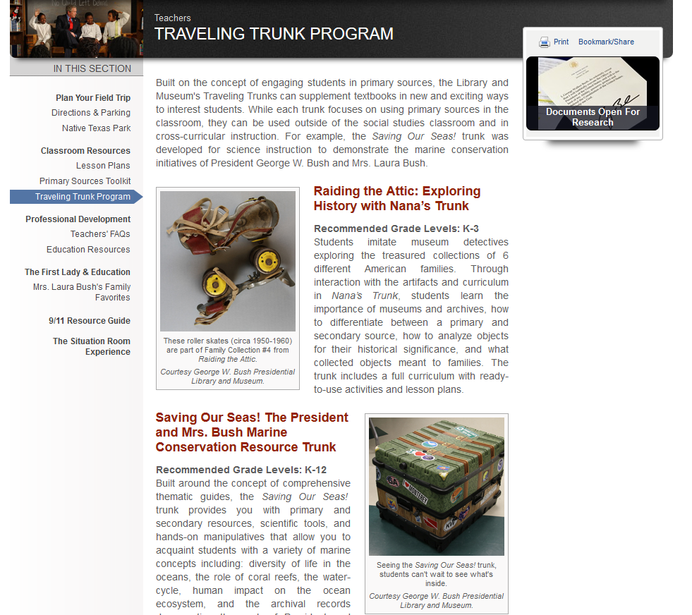
OVERALL CHANGES The website is overly verbose and could do with a basic makeover to make it more streamlined and graphically appealing.  The section on the museum itself could also be improved by connecting the arguments and interpretations in the physical museum to what is presented on the webpage.  Educator resources such as the Traveling Trunk program focus on two very minor portions of the physical exhibit, and the Presidential Hats Program explains the activity but requires the educator to email for more information.  It seems like this could be accomplished in providing a PDF of available resources at the very least.  In both cases, the website could draw upon new tools, technologies and strategies to make these educational outreach programs more engaging.

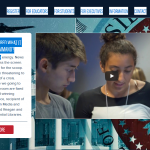
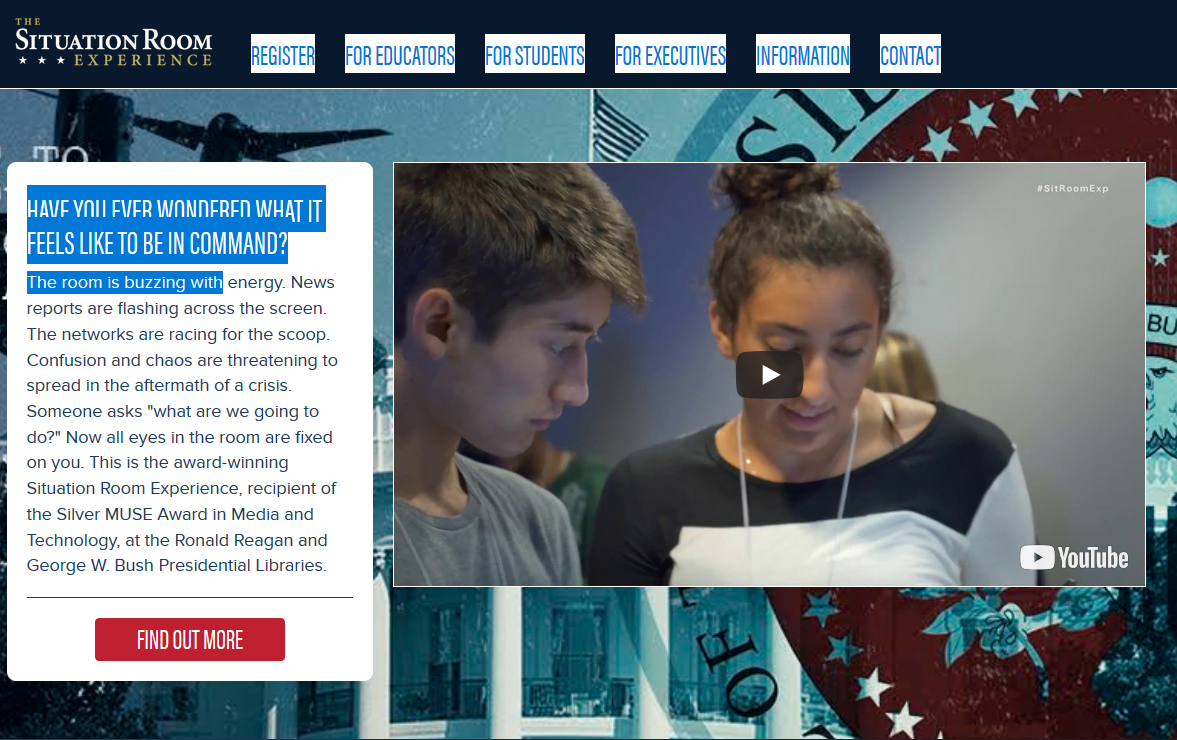
THE SITUATION ROOM EXPERIENCE Apparently, the George W. Bush Library houses a portion of the former White House Situation Room Complex though it is not part of the general exhibit.  Student groups are invited to role-play managing a constitutional crisis in these historic rooms though only 10 students may participate in the simulation at one time. Both the Bush Library and the Reagan Library run this  2017 MUSE Award winning Situation Room Experience.

The investment to make the resources supporting this visit available online is a sunk cost.  To make the Situation Room Experience available to a larger audience on a practical level, both for those in proximity to these museums and for those who are not, the NARA should investigate the potentiality of making this a stand alone digital unit.  While the point of the activity is to draw students into the museum, it is unlikely that this is a very broad draw from schools alone. And, the skills necessary to successfully navigate the simulation promote the goals of the physical museum in developing civic engagement and decision making skills in the PEOPLE of the United States.