Tools

Working on Weaving Our Story

Creating the Omeka archive for Weaving Our Story has been the culmination of five years of work as both a classroom teacher and now as a student of digital humanities.  While the archive only contains seventeen films to date, these are representative of the over 250 stories my students have produced.  The process behind producing each film is labor intensive as students not only research a historical event but also learn how to conduct an oral history interview in order to obtain their own primary source material.  This is a year long process that involves at least a hundred hours of learning inside and outside the classroom.  While screening the films at the film festival each year has been the capstone to the project, it was unfortunate that their learning, and what that learning had to offer to the community, was relegated to disk space on the school server and not to a more lasting public forum.  It is my hope to expand this archive over time to include each film so that each student has the opportunity to share her learning with the larger community.

The process for creating this archive has been complex, due in large part to the fact that I am working with data that was not initially created with the complexities of publication in mind.  Some of these complexities include the following:

  • The films are created by students so privacy is a concern for the student and for the interviewee.  Going forward, we will collect permissions as part of the production process and create naming guidelines that protect student privacy in the films.
  • Formatting and file size was also an issue.  Going forward students will submit their film in .mp4 format with a file size under 128mb to save time for the archivist in processing each film.
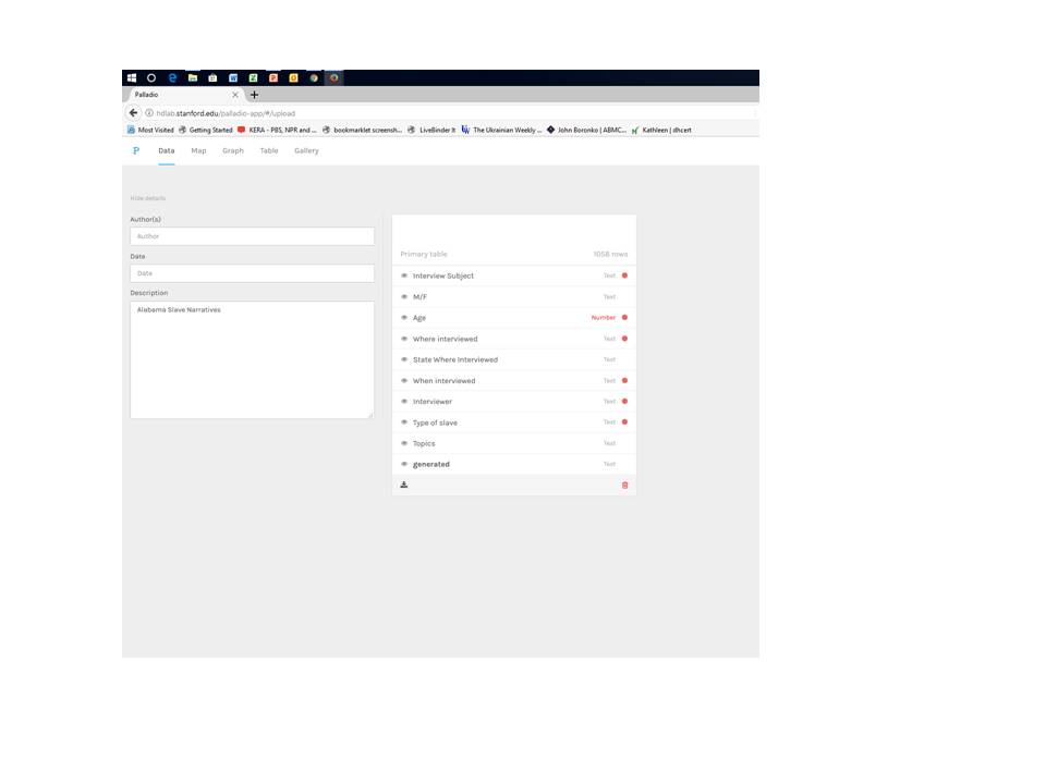
  • Each film was lacking metadata.  To address this going forward, students will fill out a Google form using a controlled vocabulary designed for this project to create a baseline for metadata going forward.  I plan to experiment with using the DropBox and CSV plug-ins in order to batch upload files in the future.
  • Finally, each film begins and ends with 5 seconds of black in order facilitate space between films when they are screened at the festival.  In the future, we will ask students to place a cover image at the start of the film so that the thumbnails will be more visually appealing when imported into Omeka.  They can end each film with 10 seconds of black in order to maintain spacing between films for the festival.

In designing the archive, I needed to work with administration and the IT director to make sure I operate within privacy guidelines.  For this reason, I am not publishing the URL of the site to this blog.  Until permissions issues have been worked out, it must remain a internally facing forum.  If you would like to view the project, you may email me for the URL and login information.  However, I hope to have those issues resolved soon when our legal department creates a permissions release document.

Hopefully, having a prototype of the archive will make people more likely to want to give consent.  And, I hope that when the project is public facing that it will serve as a draw to the community for parents who want their children to experience the type of project based, hands-on, learning that goes on each day at St. John’s.

I also needed to think about balancing the short term and long term goals for the project.  Because of privacy concerns, I did not have school permission to host the videos on a private YouTube server which would have made processing the videos into Omeka much easier.  I considered using our private web hosting platform, Bright Cove as a short term solution; however, this resource is expensive and will disappear at the end of the year.  Instead, I worked to learn how to embed the videos using the HTML plug-in.  It is a cumbersome process.  Our IT director is hopeful that another video hosting site will become available in the next year which would alleviate this problem.  However, the solution that I arrived at using HTML should work for the project over the long term.

I also needed to consider creating controlled vocabulary that would work for the entire body of films collected to date instead of simply the seventeen I added to the archive.  To do so, I reviewed each of the two hundred and fifty films to create a controlled vocabulary for subject matter keywords and also for tags.   I loaded this into a Google form.  As students create projects going forward, they can use this form to build their own metadata record for their project.  And, I can potentially crowd source creating meta data for the previously produced films by enlisting the help of interested volunteer teachers at the school.  This will help us keep a data bank of all projects completed over the years in addition to the Omeka archive.

Working in Omeka proved to be the biggest challenge to me.  I had imagined that it was a lot more “drag and drop” based on my experiences working with it earlier in the course.  In fact, it turned out to be more complicated in terms of working behind the scenes in HTML.  With some assistance, I was able to learn how to manipulate Omeka using HTML.  It would probably be beneficial for me to do some independent study about HTML in order to become more proficient in improving my design options in Omeka.  However, I am pleased with what I’ve been able to do so far in terms of sharing my students’ learning with more permanence to a larger community and the ways in which Omeka allows me to supplement student information with other information and digital history projects on the web.


Wikipedia: Behind the Words

Most internet searches inevitably return a result directing readers to a Wikipedia entry.  If you are like most of my seventh grade students, it’s the first thing their fingers will click upon.    And, if you are like many of my teaching colleagues, you will quickly redirect them to a “real” academic source.

But, increasingly teachers and scholars are understanding that Wikipedia is a “real” academic source, especially if it is used properly.  Recently, John Overholt tweeted that it is a source he uses *constantly* in his work as a curator at Harvard’s Houghton Library.  In fact acclaimed teachers such as Brad Liebrecht use it as a launching point for student research.

“I work at a very fancy university and I *constantly* use Wikipedia to get a thumbnail understanding of a subject or as a lead to find out more.” John Overbolt, Harvard Curator

“We began our research unit this year by showing the students how to get ideas from Wikipedia. This has worked well.” Brad Liebrect, Teacher and WSCSS Vice-President


Perhaps, then problem lies not in Wikipedia as a “non-academic” source but in that many academics and teachers don’t understand how to use this crowd-sourced knowledge tool.  In order to demystify the source, let’s take a look at the Wikipedia entry for Digital Humanities.

Wikipedia users are well versed with the reader format for articles with content at the top and references down below.  The content gives a general overview of the topic and the references below can provide departure points for further research.  But, to stop here really only scratches the surface of evaluating a Wikipedia entry.  To go further, it it important to explore both the revision history and the editors making the revisions as well as the discussion behind how that process works.

To do so, click on view history on the top right of the page.  This allows you to understand when the page was created and by whom.  It also tracks each edit throughout the life of the page.  One can see who is adding, removing or revising content step by step.  This can be a bit overwhelming, but it looking through content changes over the course a set of months or a year can make it easier to manage.

The most important feature of this revision history is learning the identities of the editors.  In the case of the DH page, Elijah Meeks created it in January 2006.  I can easily click on his name and discover (if I didn’t already know) that he is a digital humanities scholar.   I can also evaluate the number of contributors who don’t have identifying bibliographical data to evaluate whether or not these sources seem valid, biased, etc.  Meeks bows out of the creation of the article fairly early on, but his work is taken up by various other scholars such as Simon Mahony and Gabriel Bodard of the University of London’s Digital Humanities program.  Bodard and Mahony “check in” on the article fairly regularly throughout its development although there are some “lurkers” who don’t seem to have biographical information or exist only identified as URLs.

However, this is where the talk feature comes in handy.  Not only are we able to track edits and who is making them, we can also track the chatter around how and why those edits are happening.  For example, Elijah Meeks writes at the article’s inception on January 31, 2006, that, “I figured I should start this, since no one has.” And, in a series of contributions by unsigned users in 2014, it is evident that the edits are being made by a group of digital humanists at a meeting exploring collaborative editing.

The talk feature also allows users and editors to collaborate about what to add or to request clarifying information.  While there was some initial discourse in the talk session about how to define DH and whether or not to combine it with the definition of digital computing, the discussion was fairly straightforward and civil.  Given the difficulty of defining DH, the article does a reasonably good job of painting a broad definition of DH and explaining the history of the discipline’s ever-evolving  boundaries and the controversies/conflicts between digital and traditional scholarship.

However, the most interesting portion of the talk feature is a recent debate about the inclusion/removal of articles by a contributor for which there was some question regarding self-promotion of articles for which he was being compensated in some form.  Reading through the talk leads me to believe that the issue was a bit more nuanced than the Wikipedia editor who removed the articles understood.  However, because of the ability to look at the revision history, I was able to investigate these claims and authors.  This seems to be a case of an aggressive editor highlighted in the Slate article Wikipedia Frown.

One of the last sections of the Wikipedia entry on DH revolves around pedagogy.  It reads:

“The 2012 edition of Debates in the Digital Humanities recognized the fact that pedagogy was the “neglected ‘stepchild’ of DH” and included an entire section on teaching the digital humanities.[5] Part of the reason is that grants in the humanities are geared more toward research with quantifiable results rather than teaching innovations, which are harder to measure.[5] In recognition of a need for more scholarship on the area of teaching, Digital Humanities Pedagogy was published and offered case studies and strategies to address how to teach digital humanities methods in various disciplines.”

This is an important point, and it speaks to the opening paragraphs of this post.  While doing an extensive amount of research to vet each and every Wikipedia article would not be realistic for my seventh graders, it is reasonable for me to begin to have a conversation with them about Wikipedia and how to use it.  The problem is that many teachers haven’t had the pedagogical training to understand Wikipedia much less how to teach its proper use.  However, this is dangerous.  Wikipedia and other forms of crowd-sourced information aren’t going away.  They are going to become more and more prevalent, and it’s up to teachers to give students the time, tools and technical expertise to practice how to use them in the safety of middle school.

Comparing Tools

The process of diving into the textual data from the Works’ Progress Administration Slave Narratives has been a fascinating one, and it highlights the ways in which  tools such as Voyant, Carto and Palladio can reveals nuances in a text that are not readily apparent using one tool alone.  While all three applications rely on visualization to help the user understand the text on a deeper level, they do so in different ways.

The initial analysis of the corpus of the interviews in Voyant allowed me to discover what words (massa, house, mammy, white) come up frequently in the documents after filtering for extraneous text.  Voyant also helps me to make serendipitous discoveries based on information contained in the summary view.  Perhaps more than any of the other tools, Voyant is able to do many different tasks in order to help the user to understand what the texts themselves reveal.

However, things are not always as they seem, and careful analysis in Voyant makes it evident that the texts may not be as straight forward as they seem.  The READER view hints that although these are the Alabama narratives, they may contain information about enslavement in states outside of Alabama such as Georgia.  However, Voyant is not equipped to flesh out these nuances in an efficient manner.

Voyant READER view shows slave experience in Georgia within Alabama Narrative document

Conversely, Carto is a powerful tool in fleshing out these differences.  By mapping different aspects of the metadata of each individual record, it is easy to see that a sizable portion of the Alabama document recounts the experience of enslaved persons outside of Alabama.  If one were to load the metadata of the entire corpus into Carto, it would be possible to map where the accounts of persons actually enslaved in Alabama occur throughout the corpus of the Slave Narratives regardless of the state documents in which they appear.  In this way, researchers could visually identify the geographic locations of these interviews.  Theoretically, they could go back and manually create a revised set of Alabama documents to run through Voyant to get a more accurate understanding of the experience of those actually enslaved in Alabama.  However, based on the data sets available, Carto is not able to map the names of the actual persons interviewed, only their location.

Carto Map showing disparity between the location of enslavement and the location of interview


Finally, Palladio allows researchers to refine the data on a more precise level and also allows researchers to ask different questions of the data. Building on the ways in which Carto has confirmed initial suspicions about disparities between interview location and enslavement highlighted by Voyant, Palladio is able to use the metadata to filter for persons actually enslaved in Alabama in a much more efficient manner than is possible in Carto.  Theoretically, the entire corpus of the Slave Narratives could be loaded into Palladio allowing users more easily create a new data set of those enslaved in Alabama regardless of interview location.

Palladio also allows users to visualize how the interviews can be analyzed as individual units instead of at the document level  available in Voyant.  This allows users to understand who was being interviewed by gender, job status, topic, etc. as well as how interviews were collected by individual interviewers.  This information would be helpful to researchers in understanding the potential for gender bias in how the interviews were collected.

Finally, Palladio allows the researcher to look at interviews based on topics listed in the metadata.  And, this provides an interesting contrast to the original query in Voyant.  The initial visualization in Voyant helps the user to understand what the body of the text reveals about word frequency.  However, very few of these words appear in the topics included in the metadata.  In fact one of the only words to pop out in both visualizations, mammy, seems to be a word that is somewhat isolated in the larger context of the Alabama slave experience.  Though many of the words in the Voyant word cloud are related to the topics expressed in Palladio, few are exact. Thus, the Palladio visualization helps the researcher to understand how the choices made by the creators of the metadata influence how the larger body of the text set may be interpreted.

Palladio visualization showing topic map based on type of work among those persons enslaved in Alabama.

Visualization tools are helpful in understanding a body of text in order to formulate better questions about the text set; however, they rarely express clear cut answers about a text in the ways that mathematical graphs visually express numerical sets.


Network Visualization with Palladio

Though it can be powerful, network visualization is one of the more complex digital tools available to historians today. As Scott Weingart points out in his blog about the appropriate use of networks, historians must consider not only the nature of the network being studied in relation to  or absence from other networks but also the limits of bi-modal networks in mapping the complexity of history.

Palladio is a network mapping tool developed by Humanities+Design Research Lab at Stanford University.  It was born out of researchers’ experience in developing the Mapping the Republic of Letters Project.   Both Weingart and the Palladio developers observe that the network data available for the Republic of Letters project do not necessarily encompass all the networks  in existence at the time.  Thus, in asking questions of a set of data, it is important to understand whether or not the data do indeed qualify to answer the question.  And, it is here where network visualization can be helpful regarding ‘big data.’  As the Palladio developers point out, it is a tool “for thinking through data” to understand its potentialities and limitations in answering a hypothesis rather than visualizing the answer to a hypothesis itself.  In other words, network visualization often helps to ask questions about what one doesn’t know about a set of data more than it answers a research question itself.

As with Voyant and Carto, Palladio reveals the nuances of  the Alabama Slave Narratives in relation to their context in the larger corpus of the Slave Narratives as a whole.  One might wish to ask questions about the experience of enslaved people in Alabama, and Palladio helps the researcher to understand the nuances of the data set such as the extent to which the interviewee was male or female, working domestically or in the field or the relative frequency of topics different groups of enslaved people recounted.   Palladio also helps the researcher to understand whether or not the person was, in fact, enslaved in Alabama at all.  As with Carto, Palladio makes it abundantly clear that the experiences illuminated in the Alabama Narratives actually occurred in other states.  However, unlike Carto, Palladio allows the researcher to connect where a person was enslaved to the location, date and compiler of the interview material.  Thus, to understand the experience of field slaves in Alabama, a researcher would need to ask this research question of a differently nuanced subset of the entire Slave Narratives rather than of only the Alabama Narratives based on the prima facie evidence in its title.  The researcher could then use Palladio to create a new map of a revised data set in order to posit the original research question.

Working with Palladio was fairly straight forward, and helpful tutorials for working with the browser are available.  However,  it was time consuming.  In my experience, Firefox did not work well with Palladio.  It was impossible to name the projects and data sets as the interface did not work.  This is a shame because Firefox has a handy tool to select material for screenshots that is unavailable in Chrome which proved to be a more stable platform.  Even if I saved the Palladio file with a .json extension from Chrome and reopened the file in Firefox, the project names and table identifiers were still invisible.  Using the screenshot feature would have been helpful because exporting .svg files also proved a bit unwieldy.

The second challenge to working with network mapping tools such as Palladio is that visualizations do not automatically generate in a readable output.  Rather, they tend to show up in a tangle of data.  Turning links on and off and resizing or highlighting nodes can help.

However, even in this case, the data can be incredibly difficult to read because of the congestion of the data points.  

In this case, using the ‘facets’ tool at the bottom left of the screen can narrow the focus to a particular topic of interest, such as ‘religion,’ allowing the researcher to gather information about the data points in a more visually understandable format.

One other limitation of Palladio is that no “login” feature is available to save work in an account and come back to it later.  Visualizations must be completed in one browser sesion, and ‘tweaking’ the data often meant that work done to ‘untangle the knot’ was often lost.

Nonetheless, Palladio is an important tool for asking complex questions about data.  On a different level, I can see how it might be used to map less complex data sets.  Throughout the course, I have been thinking about how to incorporate the tools of digital history in my own middle school classroom in hopes that teaching the thought process behind these tools at its most basic level could help to train the digital historians of the future.  In a few weeks, my students will explore the network of relationships in Renaissance Florence as patrons and artisans co-existed in the cradle of Humanistic expression.  It would be interesting for them to create simple data tables based on their research that could be loaded into Palladio in order to express these relationships visually.

Part of my inspiration for the project is Paul McClean’s Art of the Network.  Much like the Republic of Letters, McClean relies on letters for his research.  Perhaps one of the future historians in my classroom  will someday use a version of Palladio to ask questions about these same data points and create a more sophisticated map that enables new scholarship in this area by using digital tools to better understand the data.


Visualizing Slave Narratives in Carto

Perhaps it is the old geography teacher in me coming out, but I really enjoyed learning about Carto.  The platform was  easy to use, and the layout was generally straightforward.

After working with the Slave Narratives in Voyant,  I began to appreciate the complexity of the source; however, the geographic visualization tools in Carto have helped me to understand that complexity in a deeper way.

The the individual documents in the corpus of the Slave Narratives are organized according to the state in which the interview was conducted.  Voyant was helpful in analyzing the variety of language used in the narratives within a particular state and across many states.  However, this analysis is somewhat misleading because the location of the interview is not necessarily the same as the location in the subject of the interview.  In other words,  what Carto analysis makes clear is that many slaves living in Alabama at the time of their interviews had actually lived in other states at the time of their enslavement.  Thus, to understand fully the experiences of persons formerly enslaved in Alabama it is necessary to exclude persons who had moved to Alabama from other states such as Georgia or Virginia from the Alabama document in Voyant.

Working with Carto is simple once you create a user name and login.  Click on NEW MAP in the upper right corner.

Next, choose CONNECT DATASET.  It is possible to upload a file, paste a URL or use datasets from the DATA LIBRARY.  Once the file is selected, choose CONNECT DATASET in the bottom right corner.

.  

This action populates the map with the data, and the user may begin to STYLE the map.  The three blue dots that appear next to line of information allow the user additional actions for editing, renaming, etc.

By selecting the VOYAGER Basemap, the user can change the background map to include a variety of backgrounds.

Clicking on the left arrow next to BASEMAP returns the user to the map view.

Next, the user can select the “alabama_interviews” dataset to begin to STYLE the appearance of the data . As before, clicking on the three blue dots allows the user to change the name of the layer.

  • STYLE allow the user to choose from several different AGGREGATIONS such as animation or heatmap options.  These can be further customized by color, size, duration, etc.
  • POP-UP creates a window of additional meta data that can be seen when the cursor clicks or hovers above a point.  This does not work with the animation or heatmap features.
  • LEGEND allows the user to change the name, color and style of the information appearing.

After returning to the main map layer by clicking the left arrow next to the name of the LAYER, the user sees the option to ADD another layer of data to the map.  In the case of this map project, I added another layer of data that reflected where the interview subjects were enslaved in contrast to where the interviews occurred.  Thus, CARTO allows me to see that  the Alabama narratives document contains information about slave experiences occurring in many other states.

Finally, by clicking on the PUBLISH button in the bottom of the sidebar menu, the user is able to publish the information as a URL or embed code.

CARTO is a user-friendly tool for providing geo-spatial visualizations to many types of data sets.  The website provides a well-outlined guide to tutorials  grouped by subject and level of difficulty.  I find CARTO to be an accessible tool for a range of abilities and uses.  In fact, I was able to experiment this week with a project I will use in my own classroom as my students explore geometry, geography and architecture through the history of the Islamic world. While by no means perfect, I am excited about the ways that this resource could become a tool increasingly used by students and teachers in the classroom.


Visualizing Slave Narratives Using Voyant

Voyant is a text-mining tool that allows the user to visually explore individual words in relationship to a body of textual data.  For the purposes of clarity, Voyant defines the entire body of textual data as the corpus while an individual portion of the textual data is called a document.  Voyant allows the user to adjust the SCALE of the data by moving between the entire corpus and an individual document.

This exercise uses textual data from the Works’ Progress Administration Slave Narratives housed in the Library of Congress. PA Slave Narratives. The collection came together between 1936-1938 when staff of the Federal Writers’ Project of the Works Progress Administration gathered over 2,300 first-person accounts from formerly enslaved people in seventeen states.

Metaphorically, Voyant is set up much like a Swiss Army Knife in that it contains a variety of specialized tools to help the user extract the most meaning out of the data.  However, for ease of introduction, this post will cover only some of the most straightforward default tools.  For any given word, Voyant is able to:

  • visually represent the word in a cloud and express word frequency numerically by scrolling over any given word. This is the default CIRRUS view.
    • By clicking on the TERMS tab, the user can see a list of the terms in the CIRRUS with counts and trends.
    • By clicking on the LINKS tab the user can visually analyze the co-relationships of words.
  • easily locate any given word in a comprehensive list of the places in which it appears in context throughout the larger corpus. This is called the CONTEXT view.
  • explore words in the larger context of a document and see the size of the document in relationship to the corpus. This is called the READER view, and it allows the user to see where in the document the word appears.
  • graph word frequency (raw or relative) over the corpus or in only one document. This is called the TRENDS view, and it also allows the user to change the type of graphs.
  • compare information about the documents as each relates to the corpus including relative length, vocabulary density, distinctive words, etc. This is called the SUMMARY view.

To begin, open up Voyant in a web browser.  For shorter amounts of text like a political speech or magazine article, one may copy and paste text directly into the window.  Larger bodies of text may be uploaded directly from a file or from URLs containing text files. Clicking REVEAL will open up the Voyant default tools described above.

Moving the cursor over this area reveals several functionality options detailed in the next image.

Each tool panel allows the user to toggle back and forth between functionalities.  For example, the CIRRUS tool also allows the user to view the data by TERMS and LINKS.  And, each tool panel allows the user to export data, change tools or define options for how the tool is being used.

A close up of the functionality options revealed at the top of each tool panel.

Exploring the CIRRUS tool, the user can now see a visual representation of word frequency.  The user may change the SCALE of the information by applying the tool to the entire CORPUS or to only one DOCUMENT.  In the case of this visualization, the DOCUMENTS are categorized by state.  The user may also broaden the number of TERMS shown in the CIRRUS view.  Clicking on the options button allows the user to remove extraneous stop-words.  In this case colloquialisms such as ain’t have been removed in addition to words such as is and not.

Certainly, many of the words highlighted in this word cloud should make viewers uncomfortable.  And, at least one of these words has come to the fore in the media this week when a school district in Mississippi removed To Kill a Mockingbird from its eighth grade curriculum.  As a teacher of literature and history, omitting this powerful work makes me uncomfortable and profoundly sad.  However, using tools like Voyant in analyzing the language of the 1930s slave narratives could help readers to understand the historical context of why Lee chose to include this word in her novel about racial and social injustice.

Noticing that many of the words reveal a connotation to a person’s place in the community, I chose to analyze the words people and folks to study how the interview subjects’ description of themselves or others was related to geographical differences in dialect. Looking at the cirrus, I am able to see that people is used 2,667 times and folks is used 5,843 times.  I am also able to view commonly linked words such as church and white.

Across the corpus, the states of Maryland and Kansas seem to have a high use of this word. However, in exploring the data in the reader view, it becomes evident that the number of documents for each state is relatively small compared to the larger corpus.

The TRENDS view shows a high relative frequency of the word “folks” in the documents from Maryland and Kansas. However, by looking at the colored graph at the bottom of the READER view, the user is able to understand that the size of the Kansas and Maryland documents are relatively small in relation to the larger corpus.

Using the TRENDS view Voyant is also helpful in analyzing raw frequency vs. relative frequency across the corpus.  The word  people  also appears relatively frequently in Maryland and Kansas.  The READER view has helps in understanding that these data sets are small. However, the body of data for South Carolina, the third most common place the word is used, is much larger, and in analyzing the raw frequencies of the use of people within that particular document, the word seems to be somewhat more consistently used.

Trend graph of the use of the word “people” in South Carolina. To do this, click on the SCALE button and toggle the selection to reflect a particular document (South Carolina) rather than the entire corpus.

Thus, this shows that that the initial visualization of the word cloud is helpful for highlighting words but that it is important to dig down into the data for each word before drawing conclusions.

The SUMMARY and CONTEXT tools are helpful in finding the unexpected.  For example, the SUMMARY tool allows the user to discover distinctive words in the documents.  By looking at these words in the CONTEXT tool pane, the user can determine if they are place names, family names or unusual colloquial terms such as the   the words pateroles and massy from the summary window.   Again, by consulting the READER and TRENDS views, the user can see that pateroles only seems to appear in the text from Arkansas; however,  the use of the word seems to be fairly well distributed across the document.  One can also glean from the READER view that pateroles is a colloquial expression for patrols meant to constrain the movements of slaves within the community.

The word “pateroles” in the TRENDS view showing frequency almost exclusively in Arkansas.

Thus, these features help the user to find something that wouldn’t be inherently apparent by initially looking only at the word cloud.  They help the user to look more carefully at the document without having to wade through the entire corpus in order to discover something unexpected – a word that wasn’t initially on the radar – and is perhaps far more interesting than the initial search question.

Voyant is a powerful tool, but it can sometimes be a bit unwieldy in terms of exporting data.  I found taking screenshots of data images was far more efficient than trying to export URLs or embed codes for data points that were buried more deeply in the data.  Working with it directly on a desktop in order to explore data might be more efficient, though it is not as effective in publishing data than can be manipulated by others.

All in all, Voyant seems to be an effective tool in helping users understand and compare texts.  As a teacher, I may explore how it could be used to analyze language in political speeches as part of a unit on persuasive language in the context of a literary study of Animal Farm.  And, as mentioned above, the tool could be used on a basic level to help students dig into primary source documents to understand colloquial language in texts like To Kill a Mockingbird or The Color Purple.